A 48-foot-wide highway billboard can hold an enormous QR code. That does not make it a good QR placement. The viewer still has to notice the offer, decide it is relevant, find a phone, open the camera, frame the code, wait for recognition, and act on the result. When the intended viewer is driving, that interaction is not merely inconvenient; it asks for attention that should stay on the road.
The central rule is simple: use a QR code only when the intended scanner can safely stop—or is already waiting—long enough to frame it and understand what will open. When that behavior is not plausible, remove the code. Give the audience a memorable brand, destination, exit, phrase, or short URL instead.
This is why “billboard QR code best practice” cannot be one universal size rule. A highway bulletin, a pedestrian wall panel, and a bus-shelter screen may all be sold as out-of-home media, but they create three different human situations.
| Placement | Intended scanner | Can the person stop safely? | Sensible QR role | Default decision |
|---|---|---|---|---|
| Roadside board seen from moving traffic | Driver | No | None | Remove the QR from the driver-facing call to action |
| Pedestrian panel in a plaza or wide corridor | Walker who can step aside | Sometimes | Optional direct-response handoff | Use only with a defined scan point and clear standing space |
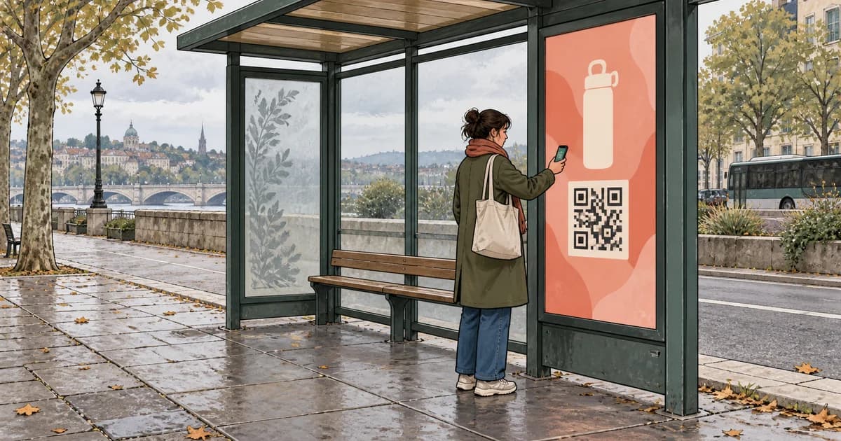
| Shelter, platform, lobby, or other waiting area | Stationary or slow-moving visitor | Usually | Primary handoff can be appropriate | Strongest fit, subject to owner rules and field testing |
Decide whether scanning is a reasonable behavior before sizing the code
Start with the person, not the artwork file. Answer five questions before a designer generates a QR code:
- Who is expected to scan? Name the role: driver, passenger, walker, person in a queue, seated traveler, or visitor standing at a directory.
- Where will that person stop? Mark an actual standing area, not an imaginary point in front of the screen. It should not block a sidewalk, doorway, platform edge, bike lane, or queue.
- Will the sight line be stable? Consider height, oblique viewing angles, glare, reflections, weather, moving shadows, screen brightness, and whether other people will cross in front of the code.
- Will the code remain visible long enough? On digital inventory, the relevant duration is not the whole loop. It is the continuous time that both the code and its explanation remain on screen.
- Is the next step worth the interruption? “Scan me” is not a benefit. The viewer should know whether the code opens a map, menu, offer, booking page, audio guide, app-store page, or something else.
For a driver, the first question settles the decision. The US National Highway Traffic Safety Administration defines distracted driving as any activity that diverts attention from driving and says safe driving requires full attention. A QR call to action aimed at a driver necessarily asks for phone handling and visual attention, so technical scannability is the wrong test. (NHTSA, “Distracted Driving”)
Permission is a separate gate. Media-owner rules can be stricter than what a designer can technically produce. Lamar’s current programmatic DOOH media-format page, for example, states that QR codes cannot be used on its digital billboard inventory. Check the exact unit, owner, municipality, and campaign category before making the code part of the concept. (Lamar, “Programmatic DOOH Media Formats”)
Three placement simulations
The following original simulations use fictional brands and planning inputs. They are not campaign results. Their purpose is to show how the decision changes when the viewer’s ability to stop changes.
Try the optional placement simulator to compare distance, symbol size, traffic speed, and display duration. Its planning result does not replace an installed-unit scan test.
Simulation 1: roadside moving traffic — remove the QR

Assume a fictional 48-by-14-foot static bulletin, a planned scan point 150 feet away, a 55 mph traffic speed, and a 500-foot visibility window. A commonly published vendor heuristic starts with a QR symbol side about one tenth of the scan distance. At 150 feet, that suggests a 15-foot symbol before adding its required clear margin—already taller than the 14-foot board. (Delivr, “QR Codes for Billboards, OOH & DOOH”)
The timing is no better. At 55 mph, a vehicle travels about 80.7 feet per second, so it crosses a 500-foot window in roughly 6.2 seconds:
500 ft ÷ (55 × 5,280 ÷ 3,600 ft/s) ≈ 6.2 s
That is not six seconds of scanning time. It includes noticing the board, reading it, deciding, and maintaining control of the vehicle. Making the code larger does not repair the behavior. The useful revision is a no-scan roadside message such as “Aquarium After Dark — Exit 12” plus a memorable domain. A passenger may later search or type the address, but the creative does not instruct the driver to use a phone.
This restraint also fits ordinary OOH design pressure. Lamar advises that mobile out-of-home audiences often have only a few seconds of exposure and recommends concise, highly legible messages. OUTFRONT similarly tells designers to keep messaging concise and check visibility at varying distances. (Lamar, “Design Tips”; OUTFRONT, “Creative Advertising Best Practices”)
Simulation 2: pedestrian plaza — create a place to stop

The fictional plaza panel faces a wide pedestrian area. The planned farthest scan point is 15 feet, and the layout reserves a clear step-aside area outside the main walking line. Using the 10:1 heuristic only as a first calculation, the black symbol area starts at 1.5 feet, or 18 inches.
The demo deliberately uses a Version 3 QR symbol. Version 3 contains 29 modules per side. QR Code specifications also require a clear “quiet zone” four modules wide on every side, so the complete white tile spans 37 modules. An 18-inch symbol therefore becomes a tile of about 23 inches:
18 in × (29 + 8) ÷ 29 ≈ 23.0 in
The distinction matters. “Make the QR 18 inches” is ambiguous unless production knows whether that number describes the black symbol or the finished tile including its quiet zone.
The code sits in the middle-to-lower portion of the poster, beside the promise “Scan for tonight’s vendor map,” with a visible fallback domain. The artwork uses one code, not a row of codes for menus, tickets, and social profiles. The standing position gives the visitor a stable camera angle without forcing other pedestrians to walk around them.
This is still a testable hypothesis, not an automatic pass. The team should print or display the finished asset at size, stand at the marked points, test from the left and right, and repeat under the lighting expected during the campaign.
Simulation 3: waiting area — make the handoff persistent

For the fictional shelter screen, the intended scan range is four to seven feet. One tenth of seven feet is 8.4 inches, so the design rounds the Version 3 symbol up to 9 inches. Including the four-module quiet zone, the finished white tile is about 11.5 inches.
This range is consistent with the scale of a specific public-screen study published by OAAA and Intersection. On 55-inch digital screens, their team tested QR sizes from 100 to 1,000 pixels and reported that 250–300-pixel codes—about 6.25–7.5 inches in their setup—could activate from roughly four to seven feet. They also found that codes near the top of higher-mounted screens were less successful, advised using a single code, and recommended showing it for the full ad slot. The authors explicitly described their distance results as ballpark figures that can vary with lighting and camera focus, so treat this as useful scoped evidence, not a universal minimum. (OAAA, “The QR Code Comeback: 5 Tips for Out of Home Designers”)
The simulation therefore keeps the code in the lower-middle area and holds both code and CTA for the full fictional 10-second slot. The surrounding creative may animate, but the QR symbol itself should remain stable. A person who has already stopped for a bus or train can read the destination, raise a phone, and try again if focus takes a moment.
Size from the intended scan point, not from the canvas
The 10:1 ratio—scan distance divided by symbol side—is a useful production conversation starter, not a standard that guarantees recognition. It does not account for camera hardware, code density, focus behavior, motion, glare, screen pixel pitch, damage, compression, viewing angle, or the person’s ability to stand still. Use it to create a first proof, then test the finished unit.
| Simulation | Farthest intended scan distance | 10:1 starting symbol side | Planning result |
|---|---|---|---|
| Roadside moving traffic | 150 ft | 15 ft | Reject the driver-scan interaction regardless of theoretical size |
| Pedestrian plaza | 15 ft | 1.5 ft / 18 in | Reserve an approximately 23-inch Version 3 tile including quiet zone, then field-test |
| Waiting area | 7 ft | 0.7 ft / 8.4 in | Round to a 9-inch symbol and approximately 11.5-inch tile, then field-test |
Do not confuse four distances:
- Notice distance: where the ad first becomes visible.
- Reading distance: where the headline and offer become understandable.
- Scan distance: where the intended user should be able to frame the code.
- Stopping position: where that person can safely stand while doing it.
A plaza poster may be noticeable from 50 feet away but designed to scan at 10–15 feet. That is normal. Enlarging the code for the maximum notice distance can consume the layout without creating a better interaction.
Protect the modules, quiet zone, and destination
A QR code is not a decorative texture. It is a grid of modules that a decoder must distinguish. DENSO WAVE, the QR Code developer, documents versions from 21 by 21 modules for Version 1 to 177 by 177 for Version 40; adding more encoded data generally requires more modules. It also specifies a quiet zone four modules wide around every side and notes that larger modules are easier to read. (DENSO WAVE, “Information Capacity and Versions of QR Code”; “Point for Determining the Code Area”; “Point for Setting the Module Size”)
That leads to practical production rules:
- Encode a short redirect on a domain the advertiser controls, such as
brand.example/q/plaza07, rather than a long destination full of campaign parameters. - Put analytics parameters behind the redirect. A shorter encoded string can keep the symbol less dense.
- Export a vector QR asset or a raster at the media owner’s exact final pixel dimensions. Do not let a layout tool blur module edges through fractional scaling.
- Keep the full four-module quiet zone free of type, logos, borders, patterns, photography, and “helpful” arrows.
- Prefer a conventional dark symbol on a plain light tile with strong contrast. Do not assume every camera will tolerate reversed colors, gradients, translucent tiles, or a photographic background.
- Use one code. Multiple codes compete for camera focus and force the viewer to understand a choice before the handoff.
- Do not treat high error correction as permission to cover the center with a large logo. DENSO notes that higher correction levels add restoration capability but also increase code size. (DENSO WAVE, “Error Correction Feature”)
The redirect is also operational insurance. It lets the team fix a destination or end a promotion without reprinting a static panel. That flexibility only helps when the redirect domain, account access, renewal, and post-campaign behavior are owned and documented.
Put the benefit and destination beside the code
A QR square does not explain itself. The copy around it should answer two questions: why should I scan, and what will open?
| Generic copy | Stronger, specific copy | What improves |
|---|---|---|
| Scan me | Scan for tonight’s vendor map | Names the immediate utility |
| Learn more | Scan to compare all three membership plans | Defines the content and scope |
| Download now | Scan to save the museum audio guide | Explains what is being saved |
| Get offer | Scan for today’s in-store pickup offer | Adds timing and redemption context |
Do not promise “live wait times,” “exclusive prices,” or “instant approval” unless the landing experience genuinely provides them. The physical ad and landing page should use the same noun, offer, and time condition. A person who scans “tonight’s map” should not land on the organization’s generic homepage.
The landing page should also respect the context. Open directly to the promised content, keep the first action obvious on a phone, avoid an unexpected app-install gate, and state any important eligibility or expiration terms before asking for personal information. A visible short domain beside the QR gives people a fallback and helps them judge whether the camera preview points to the expected brand.
Treat reachable QR codes as physical security surfaces
Street-level codes can be covered with stickers or otherwise replaced. The US Federal Trade Commission has warned about scammers covering physical QR codes, including codes on parking meters, and recommends checking the URL before opening it. The FBI’s Internet Crime Complaint Center similarly warns that criminals can replace physical codes and advises users to inspect for tampering and verify the destination. (FTC, “Scammers Hide Harmful Links in QR Codes to Steal Your Information”; FBI IC3, “Cybercriminals Tampering with QR Codes to Steal Victim Funds”)
For an advertiser, that means the campaign plan should include more than link monitoring:
- Integrate the code into the printed design rather than applying a separate sticker when possible.
- Inspect reachable shelter, kiosk, and poster units during the run, especially after installation and in high-touch locations.
- Print the expected branded domain next to the code so a replacement creates a visible mismatch.
- Monitor the redirect and landing page, keep account recovery current, and define what the URL will show after the offer ends.
- Avoid asking for payment, passwords, or sensitive identity information immediately after an outdoor scan unless the use case truly requires it and the trust path is exceptionally clear.
No visual treatment makes a physical QR tamper-proof. The goal is to make substitution easier to notice and faster to remediate.
Keep a digital QR code visible for the whole opportunity
A final-frame QR is usually a production mistake. The viewer first has to notice the ad, then understand the offer, then decide to scan. If the code appears only after the animation, the camera may open as the slot changes.
OAAA’s public-screen study recommends presenting the code for the full slot, and its single-code guidance reduces focus competition. Keep the code, quiet zone, CTA, and expected domain stable from the first useful frame to the last. Animate around that block rather than moving, rotating, scaling, or dissolving the QR itself.
Before applying that advice, confirm the owner permits a QR on the exact unit. A format may have enough dwell time but still prohibit codes, restrict calls to action, or impose its own creative review. The acceptance check belongs before design, not at trafficking.
Measure the handoff without pretending a scan explains the billboard
QR reporting is useful when delivery, scan, and response remain separate.
| Layer | What you may observe | What it does not prove |
|---|---|---|
| Delivery or estimated exposure | Plays, posting dates, owner-reported impressions, modeled audience | That a particular person noticed or read the code |
| QR handoff | Redirect requests, timestamp, unit or creative identifier, landing sessions | A unique human, full-ad attention, or incremental impact by itself |
| Response | Map saves, sign-ups, purchases, bookings, or another defined action | That the QR alone caused the action without a comparison design |
Give each unit—or at least each meaningfully different placement—a distinct redirect. The short code can redirect to a tagged destination such as:
https://brand.example/night-map
  ?utm_source=ooh
  &utm_medium=qr
  &utm_campaign=harbor_nights
  &utm_content=plaza_panel_07
Google’s Analytics guidance describes UTM parameters as a way to identify campaigns that refer traffic. Keep the naming convention documented before launch so plaza_panel_07 does not become five spellings across the report. (Google Analytics, “Analytics for Marketing Specialists and Digital Analysts”)
Report recorded QR requests, landing sessions, and qualified actions as separate counts. Deduplicate only according to a declared method. If you divide scans by owner-reported impressions, label the denominator as reported or modeled and the numerator as recorded requests; do not present that mixed ratio as a precise human conversion rate. Repeat scans, camera previews, bots, privacy controls, consent settings, and cross-device behavior can all create differences between redirect logs and analytics sessions.
A stronger evaluation uses comparable placements and a predeclared question. For example: does the shelter version with “Scan to save the map” produce more qualified map saves than a shelter version that shows only a short URL? Even then, check whether location, schedule, audience, creative rotation, or offer changed before assigning causality.
Preflight the installed experience, not just the artwork
Use this sequence before release:
- Confirm the exact owner, unit, jurisdiction, category, and QR acceptance rule.
- Name the intended scanner. If the answer is “driver,” remove the scan CTA.
- Mark a safe standing or waiting position and observe pedestrian flow.
- Measure the farthest intended scan distance and likely oblique angles.
- Calculate a first symbol size, then add the full quiet zone separately.
- Generate one high-contrast code from a short, controlled redirect.
- Put a concrete benefit, expected destination, and fallback domain beside it.
- Keep the QR block static and, on digital, present for the full slot.
- Inspect a full-size print or exact-pixel display proof for sharp modules and an untouched quiet zone.
- Test the finished unit with multiple current and older phones at the planned distances, heights, angles, and day/night lighting conditions.
- Exercise the redirect, analytics tags, landing page, expiration behavior, and no-camera fallback.
- Inspect reachable physical units and monitor the domain throughout the campaign.
A desktop mockup can catch composition problems. It cannot reproduce the installed screen’s brightness, a laminated poster’s reflection, a person standing off-axis, a dirty shelter panel, or the time pressure of a real walkway. The field test is where the design becomes an interaction rather than a square in a layout.
The best roadside QR decision may be no QR at all
A QR code is a request for time, space, attention, and trust. Roadside moving traffic provides the wrong combination, so a larger code does not rescue the idea. A pedestrian placement can work when the design creates a safe place to stop. A waiting-area placement is stronger because the audience is already stationary, but it still needs owner approval, correct sizing, a protected quiet zone, a clear promise, a persistent display, a trustworthy destination, and real-device testing.
Design the stopping opportunity first. The QR code comes after it.
Sources
- “Distracted Driving” — National Highway Traffic Safety Administration. Current public guidance; checked September 9, 2026.
- “The QR Code Comeback: 5 Tips for Out of Home Designers” — Out of Home Advertising Association of America / Intersection, January 27, 2021. Includes a scoped UX study on 55-inch public screens.
- “Programmatic DOOH Media Formats” — Lamar Advertising Company. Current inventory page; checked September 9, 2026.
- “Design Tips” — Lamar Advertising Company. Current design guidance; checked September 9, 2026.
- “Creative Advertising Best Practices” — OUTFRONT Media. Current design guidance; checked September 9, 2026.
- “QR Codes for Billboards, OOH & DOOH” — Delivr, last updated February 3, 2026. Used only for the vendor 10:1 sizing heuristic, not as a universal standard.
- “Information Capacity and Versions of QR Code” — DENSO WAVE. Technical reference; checked September 9, 2026.
- “Point for Determining the Code Area” — DENSO WAVE. Technical reference for the four-module quiet zone; checked September 9, 2026.
- “Point for Setting the Module Size” — DENSO WAVE. Technical reference; checked September 9, 2026.
- “Error Correction Feature” — DENSO WAVE. Technical reference; checked September 9, 2026.
- “Analytics for Marketing Specialists and Digital Analysts” — Google for Developers. Current guidance on campaign URL tagging; checked September 9, 2026.
- “Scammers Hide Harmful Links in QR Codes to Steal Your Information” — US Federal Trade Commission, December 2023.
- “Cybercriminals Tampering with QR Codes to Steal Victim Funds” — FBI Internet Crime Complaint Center, January 18, 2022.