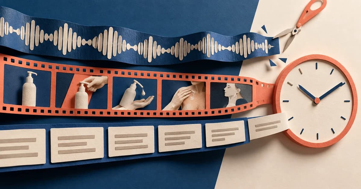
A six-box storyboard can make a 15-second ad look finished before anyone has answered the difficult questions. Is each box a new shot? How long does the hand movement take? Does the voiceover continue after the picture cuts? Will the product name still be readable when the platform interface appears?
The useful answer is not “give every panel 2.5 seconds.” It is to put picture, action, audio, on-screen text, and transitions on one shared clock, while giving panels and shots separate IDs. A panel records a visual state the team needs to understand. A shot records a continuous piece of picture between cuts. One shot may need several panels, and one panel may be held for several seconds.
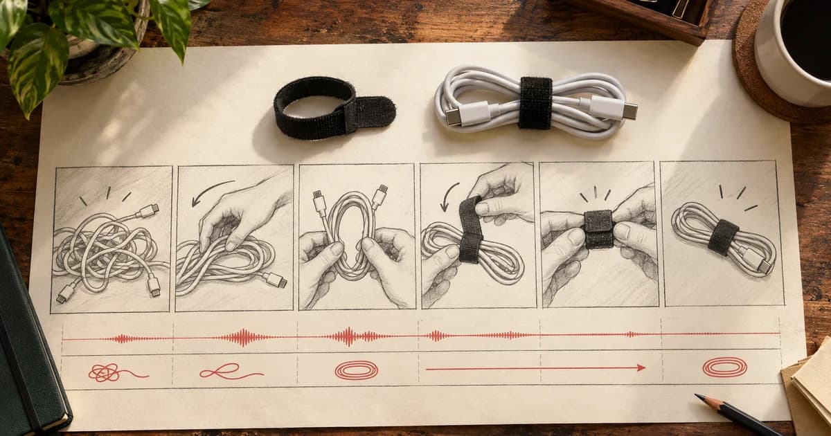
This guide includes an original fictional example for DeskLoop, a hook-and-loop cable tie. The package contains a filled storyboard, a blank reusable template, a 15-second timeline, and a timed teaching animatic. The example uses six panels because that is a manageable teaching layout—not because six is an optimal number of panels for an ad.
First, separate the units people often mix together
A storyboard is most useful when every person reading it understands what changes from one row to the next. Teams use these terms with some variation, so define the working meaning inside the document instead of assuming everyone shares the same vocabulary.
| Term | Working meaning in this template | The decision it answers |
|---|---|---|
| Beat | A change in the communication job: introduce the problem, reveal the product, demonstrate the action, or ask for the next step. | What must the viewer understand now? |
| Script | The ordered plan for spoken words, action, and sometimes visual direction. | What is said or described? |
| Panel | One visual state plus its production notes. | What needs to be drawn or shown clearly? |
| Shot | One continuous piece of picture between edits in the planned final sequence. | Where does the picture actually cut? |
| Storyboard | Panels arranged in viewing order to plan composition, action, and continuity. | What should the audience see, and in what order? |
| Shot list | The operational capture list: setup, framing, angle, movement, subject, and other production needs. | What footage must the crew capture? |
| Animatic | Storyboard imagery placed on a real timeline, often with rough audio. | Does the proposed sequence work at speed? |
The distinction between panel and shot matters most for this article. StudioBinder’s storyboarding guide explicitly allows multiple panels when a single shot contains complicated blocking or movement. That is why a hand beginning to wrap a cable, moving around it, and pressing the tie closed can occupy three panels without creating three camera setups or three edits.
A storyboard and a shot list solve different problems. Adobe’s shot-list overview treats the latter as a guide to camera setups and coverage. Connect both documents with shared Shot IDs, but keep the visual plan separate from the capture list.
An animatic is where the still plan gains an honest clock. Adobe’s animatic guide describes rough storyboard sequences rendered with varying frame lengths and optional audio. It tests timing, not final performance, typography, platform delivery, or campaign results.
Real commercial boards reinforce the need for this distinction. Storyboard artist Rachel Merrill publishes five six-panel sheets for a Willow commercial—30 panels in total—and a montage labeled as storyboard-to-final commercial examples. In the four paired stills we could inspect, framing, pose, and object placement changed between drawing and final image. The stills show production interpretation, but not shot duration, audio timing, edit points, or ad performance; the final video was not available for timed playback in this review.
Lock one product truth and one placement before drawing
A good board begins with a constraint, not an empty grid. For the teaching example, the fictional brief is:
Show a US viewer how DeskLoop closes around an already-coiled charging cable, then invite them to see how it works, in a 15-second vertical in-feed ad.
The product truth is deliberately narrow. The cable is already coiled. DeskLoop wraps around that coil and closes. The ad must not imply that the tie coils or untangles the cable by itself, protects electrical performance, works at a measured speed, or has durability and price claims that the fictional brief has not established.
The selected planning context is TikTok Auction In-Feed, Non-Spark, US, left-to-right layout, with no anchor or interactive add-on. This does not make the layout universal. TikTok’s Auction In-Feed specification, last updated June 2026, recommends 9:16 vertical video at 540 × 960 pixels or higher for Non-Spark ads. It also says the usable safe zone changes with the aspect ratio, caption length, and additional formats, and that a preview may differ slightly from a device-specific live rendering.
There is a current documentation conflict worth handling rather than hiding. The same Auction specification allows Non-Spark video up to ten minutes, while TikTok’s Ad Format and Functionality policy, last updated April 2026, gives a general range of 5–60 seconds and requires audio, legible high-resolution video, and dynamic content for the listed markets, including the United States. The DeskLoop plan is 15 seconds, so it sits inside both stated ranges. That does not resolve the platform’s broader contradiction; it simply avoids building this example on the disputed upper limit.
Record the exact buying product, creative type, market, language direction, aspect ratio, caption treatment, add-ons, and check date. Then use the matching current safe-zone file and preview. “Vertical social ad” is not a sufficient placement specification.
Build the story on a clock, not six equal boxes
The DeskLoop plan uses half-open intervals—written as [In, Out)—so a boundary belongs to the event beginning there, not to both neighboring events. Panel P04 is [7.00, 9.00); P05 begins at 9.00. Their durations add cleanly without counting the 9.00 boundary twice.
The six panel intervals are:
2.0 + 2.0 + 3.0 + 2.0 + 2.5 + 3.5 = 15.0 seconds
At 30 frames per second, the same plan is:
60 + 60 + 90 + 60 + 75 + 105 = 450 frames
Those six panels collapse into four shots and three picture cuts. The cuts occur at 2.00, 9.00, and 11.50 seconds. The boundaries at 4.00 and 7.00 seconds are new drawings inside the same overhead shot.

The timeline is also available as an editable SVG diagram.
The completed six-panel storyboard
The board below is fully populated with timing, framing, action, audio, text, transition, and product/CTA visibility. The art is intentionally simple. A rough board succeeds by removing ambiguity, not by pretending to be the finished ad.

A machine-readable version is available as the filled storyboard CSV.
| Panel / shot | Time | Picture and action | Audio | On-screen text | Transition and product job |
|---|---|---|---|---|---|
| P01 / SH01 | 0.00–2.00 | Wide three-quarter desk view. An already-coiled but untied cable sits beside an open DeskLoop. A hand reaches toward the coil. | A01, 0.30–1.80: “Keep this coil together.” | CC01, 0.30–1.80: same words. | Start. The product is visible, but there is no CTA. |
| P02 / SH02 | 2.00–4.00 | Fixed overhead close-up. The hand presents the open tie and moves it toward the same coil. | A02, 2.10–3.80: “Meet DeskLoop.” | CC02, 2.10–3.80: same words. | Cut at 2.00. The product is named. |
| P03 / SH02 | 4.00–7.00 | Same camera and scale. The tie wraps around the existing coil. | A03a, 4.20–5.80: “Wrap the tie.” | CC03a, 4.20–5.80: same words. | No cut at 4.00. The action becomes understandable. |
| P04 / SH02 | 7.00–9.00 | Same camera. The ends press together; the hand reveals the closed tie. | A03b, 7.10–8.70: “Press it closed.” A03c begins at 8.70: “Then put it away.” | CC03b, 7.10–8.70; CC03c begins at 8.70. | No cut at 7.00. The closed product must remain visible. |
| P05 / SH03 | 9.00–11.50 | Three-quarter drawer view. The hand places the same tied coil into the open drawer. | A03c continues until 10.20; it does not restart. | CC03c continues until 10.20. | Cut at 9.00. Product continuity carries across the edit. |
| P06 / SH04 | 11.50–15.00 | Tight final view of the same tied coil with clear text space. The hand exits. | A04, 11.70–14.20: “See how DeskLoop works.” | T03/CC04, 11.50–15.00: same phrase as one visible graphic. | Cut at 11.50. Product, name, and next step share the final frame; no fake button is drawn. |
The most important row sequence is P02–P04. The viewer receives three visual states—open tie, wrapping movement, closed tie—but the camera never cuts. Separate Panel IDs make the movement legible to production. The repeated Shot ID prevents the editor from treating the drawings as three unrelated setups.
P04 and P05 demonstrate a second distinction: audio and picture do not need the same boundary. “Then put it away” starts before the drawer cut and ends after it. In editing terms, this resembles an L-cut, where outgoing audio continues over new picture; Adobe’s explanation of J- and L-cuts is a useful reference. In the storyboard, the plainest production label is even better: A03c continues across the cut at 9.00.
Give audio and text their own event records
A panel heading is not precise enough for voiceover or text. Write each event’s exact words, start, end, and role. That makes three common errors visible before edit day:
- A voice line is longer than its allocated window.
- A caption silently restarts when the picture cuts.
- The final CTA duplicates the same sentence in two competing graphics.
DeskLoop uses 20 spoken words across six audio events. Word count alone does not prove they fit. To test the event clock, we generated a synthetic scratch read and measured each separate audio file before placing it in the animatic.
| Audio cue | Planned window | Window length | Measured synthetic read | Remaining margin |
|---|---|---|---|---|
| A01 | 0.30–1.80 | 1.50 s | 1.418 s | 0.082 s |
| A02 | 2.10–3.80 | 1.70 s | 1.565 s | 0.135 s |
| A03a | 4.20–5.80 | 1.60 s | 1.540 s | 0.060 s |
| A03b | 7.10–8.70 | 1.60 s | 1.395 s | 0.205 s |
| A03c | 8.70–10.20 | 1.50 s | 1.352 s | 0.148 s |
| A04 | 11.70–14.20 | 2.50 s | 2.245 s | 0.255 s |
This is a useful diagnostic, not a voiceover approval. A03a has only about six hundredths of a second of measured margin in this machine read. A human delivery with a natural pause could overrun it. The next action is not to declare “20 words fits 15 seconds”; it is to record the intended performer, listen at normal speed, and move the boundary or rewrite the line when necessary.
The 15-second DeskLoop animatic is 540 × 960, 30 fps, and 450 frames, with the picture cuts specified above. It includes the scratch voice and burned-in captions; the same caption events are provided in an SRT file. A poster summarizing the verified properties is included for quick review.
Captions should be planned as access to the audio, not as decoration. The W3C explanation of prerecorded captions notes that captions may need to include meaningful non-speech audio as well as dialogue. It does not provide a universal characters-per-second rule for mobile advertising, and this article does not invent one. In a real DeskLoop shoot, a meaningful fastening sound might deserve a caption or sound description; a sound that has not been recorded should not receive a fictional timecode.
Also keep three text systems separate:
- Captions represent spoken or meaningful audio.
- Creative overlays communicate claims, labels, or the next step inside the video.
- Platform ad captions are interface-level copy supplied with the ad and may have their own limits and safe-zone effects.
DeskLoop’s final phrase serves as both the visible CTA and the final spoken caption, so it is drawn once. The storyboard does not add a second button-shaped graphic, because unsupported interaction can mislead viewers and TikTok’s current policy expressly rejects controls or gestures that portray functionality the placement does not provide.
Turn the storyboard into a production handoff
Once the story reads clearly, collapse the panel plan into the setups the production team must actually capture. The same Shot IDs now connect the storyboard to the shot list.
| Shot | Panels / time | Required input state | Required output state and dependencies |
|---|---|---|---|
| SH01 | P01 / 0.00–2.00 | Cable already coiled but untied; open DeskLoop nearby. | Hand reaches in. Preserve the coil shape and product orientation for SH02. |
| SH02 | P02–P04 / 2.00–9.00 | Same coil; tie open; fixed overhead camera. | Tie wrapped and pressed closed; closure visible. No internal cuts. Capture A02, A03a, A03b, and the beginning of A03c; preserve the same prop for SH03. |
| SH03 | P05 / 9.00–11.50 | Same closed coil; drawer open. | Coil placed in drawer. A03c and CC03c continue across the 9.00 cut instead of restarting. |
| SH04 | P06 / 11.50–15.00 | Same tied coil in a clean final composition. | Product remains identifiable; hand leaves; one final message stays visible through 15.00. |
This handoff exposes continuity failures early. If the tie switches color, the coil changes shape, or the closure disappears between SH02 and SH03, the board’s product truth is broken even if every shot is attractive. If the cut moves from 9.00 to 9.50, A03c and CC03c must be rechecked because they cross that boundary. A timestamp is rarely an isolated edit.
The capture order may differ from the viewing order. A crew might film all overhead material together and the drawer setup later. Shared IDs preserve the final sequence while the shot list organizes production efficiently.
Change the grid when six panels stop helping
Six slots are a starting interface, not a story law. Two different problems require two different revisions.
Revision A: add a drawing without adding a shot or a second
Suppose P03 does not clearly show which end of the tie passes around the cable. Split its existing three-second interval into:
- P03a / SH02: 4.00–5.50
- P03b / SH02: 5.50–7.00
At 30 fps, that is 45 frames plus 45 frames—the same 90-frame interval P03 already occupied. The result is seven panels, four shots, three cuts, and 15 seconds. Audio, captions, and the final runtime remain unchanged. Whether the extra drawing actually solves the confusion still needs a reader or production review; the arithmetic only proves that it does not require more time.
Revision B: make room for an action that really takes longer
Now assume a hand rehearsal shows that wrapping needs 4.5 seconds rather than the planned 3.0. Keeping every other allocation would produce:
2.0 + 2.0 + 4.5 + 2.0 + 2.5 + 3.5 = 16.5 seconds
The grid cannot solve that. Something else must give. One explicit revision is:
- Reduce the opening context from 2.0 to 1.0 second and remove “Keep this coil together.”
- Keep the product introduction at 2.0 seconds.
- Give the continuous demonstration 6.5 seconds across P03 and P04.
- Reduce the drawer action from 2.5 to 2.0 seconds.
- Keep the final product/CTA view at 3.5 seconds.
The new budget is:
1.0 + 2.0 + 4.5 + 2.0 + 2.0 + 3.5 = 15.0 seconds
Panel boundaries become 0 / 1 / 3 / 7.5 / 9.5 / 11.5 / 15. Picture cuts move to 1.00, 9.50, and 11.50. The opening voice line disappears rather than being squeezed into an implausibly short slot.
This branch is not automatically better. It trades context and storage time for a more plausible demonstration. That is the point of a timed storyboard: every change reveals what it costs.
Review arithmetic, performance, and placement separately
A storyboard can pass one check and fail the next. Use three review states rather than one vague “approved” label.
| Review | What it proves | DeskLoop result | What remains |
|---|---|---|---|
| Document arithmetic | Intervals total the target runtime; panel, shot, audio, and text IDs are internally consistent. | Passed: 15.000 seconds, 450 frames, four shots, three cuts. | Recalculate after every timing revision. |
| Performed action and voice | A real hand can complete the motion; intended speech and pauses fit naturally. | Synthetic motion and machine scratch VO were timed. | Film or rehearse the actual product action and record the intended voice. |
| Rendered placement review | Final typography, product visibility, overlays, and current interface clearance work at delivery size. | The 540 × 960 teaching animatic shows the planned picture, captions, and sound. | Apply the current matching TikTok safe-zone asset, use the actual ad caption/add-ons, preview on target devices, and obtain platform approval. |
The included motion is a schematic vector demonstration, not a measured human hand performance. The captions are readable in the inspected output, but they are not a guarantee for every phone, language, font substitution, or interface state. The file has not been uploaded as an ad, reviewed by TikTok, shown to a representative audience, or tested for campaign performance.
That separation protects the team from a common handoff mistake: treating a correct duration sum as creative validation. A 15-second container can still contain an impossible gesture, hidden product, rushed line, unsafe text, or misleading CTA.
Use the blank storyboard without becoming trapped by it
The blank six-panel template is also supplied as an editable SVG and a CSV. Each slot asks for:
- Panel ID, Shot ID, and Time In/Out
- Picture and framing
- Action as an input state → output state
- Exact audio words, sound effects, and timing
- Exact on-screen text and timing
- Transition: cut, no cut, or camera move
- Product and CTA visibility
- Status: estimated, measured, or approved
Use it in this order:
- Write one truthful product demonstration and one viewer next step.
- Name the exact placement and canvas before composing.
- Mark 0.00 and 15.00, then budget the major actions.
- Draw a new panel whenever a visual state needs clarification.
- Assign a new Shot ID only when the picture actually cuts or the planned setup changes.
- Add audio and text as independent events on the same clock.
- Convert the board into an animatic, read the copy, rehearse the action, and revise the budget.
- Create the shot-list handoff with prop input/output states and dependent cue IDs.
- Check current safe zones and final-size legibility for the exact delivery configuration.
The board is finished when another person can answer three questions without guessing: What should be visible? What should be heard? When does each event begin and end? Six attractive drawings without those answers are still an idea. A modest board with a truthful product action, a shared clock, and a clear handoff is already a production plan.
Sources
- “Storyboard Rules — The Do’s and Don’ts of Storyboarding”, StudioBinder, May 25, 2025.
- “What Are Animatics and How Can I Make Them?”, Adobe, publication date not stated.
- “How to Make a Shot List”, Adobe, publication date not stated.
- “Create J and L Cuts in Premiere Pro”, Adobe, updated October 19, 2025.
- “Understanding Success Criterion 1.2.2: Captions (Prerecorded)”, W3C Web Accessibility Initiative, updated August 10, 2026.
- “TikTok Auction In-Feed Ads”, TikTok For Business, last updated June 2026.
- “Ad Format and Functionality”, TikTok Advertising Policies, last updated April 2026.
- “Storyboards and Animation Background Art”, Rachel Merrill, publication date not stated.