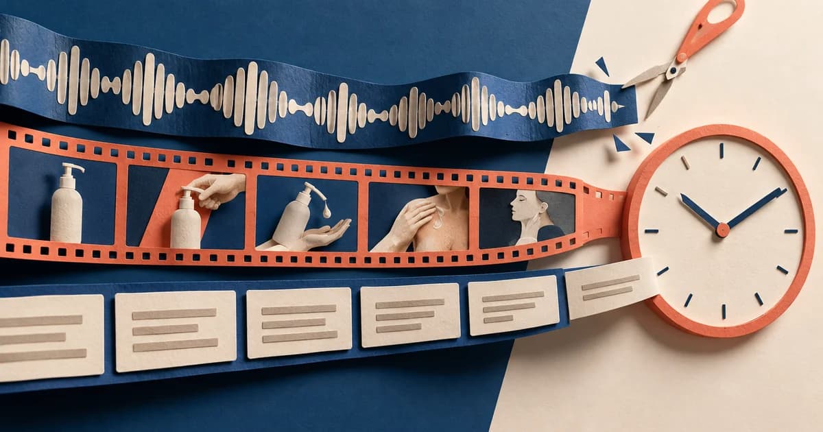
A creative team can export every common aspect ratio and still deliver one weak Demand Gen idea six times. The 9:16 version may leave the product under interface controls. The horizontal version may look polished but say nothing before a YouTube viewer decides whether to engage. The Gmail version may depend on a lifestyle image when the first job is to earn an expansion. The 300×250 version may inherit so much copy that none of it is readable.
The central answer is simple: keep one campaign promise, then rebuild its visual and copy hierarchy for the placement. Aspect ratio is only the container. Placement determines what the customer is doing, what the ad must communicate first, how much of the message Google may assemble outside the image, and whether the story has time to unfold.
Google's current Demand Gen documentation covers YouTube, Discover, Gmail, Maps, and the Google Display Network; the creative eligibility table also lists Google video partners. It also records a June 2026 start for eligible advertisers to move existing Display campaigns into Demand Gen. That makes many older “Demand Gen equals YouTube, Discover, and Gmail” explainers incomplete. More importantly, not every ad format is eligible for every placement: image-only ads are not eligible for YouTube in-stream, video is not eligible for Gmail, and uploaded display ads are a GDN format. (About Demand Gen campaigns; Demand Gen creative specifications)
This guide uses one fictional product—Morrow Press, a compact single-cup coffee brewer—to show how the same offer changes across six verified contexts. The mockups are original teaching assets, not live Google screenshots, served ads, or performance evidence.
Placement is not another word for aspect ratio
Three decisions sit on top of each other in Demand Gen:
- Channel or placement: YouTube in-stream, YouTube in-feed, YouTube Shorts, Discover, Gmail, Maps, or the Google Display Network.
- Ad format: image, video, carousel, product-feed combination, or uploaded display.
- Asset presentation: orientation, crop, text combination, safe area, and the order in which the viewer encounters the message.
A 9:16 file solves only part of the third decision. Google recommends 9:16 images and videos for YouTube Shorts, but that does not by itself prove Shorts-only delivery. Channel controls are set at the ad-group level, and video creative preferences separately let advertisers assign videos to in-stream, in-feed, or Shorts formats. If video preferences are not configured, the default behavior is all formats; a single video also serves across all formats. (Channel controls in Demand Gen; Creative preferences in Demand Gen)
The distinction matters because a technically accepted crop can still be strategically wrong. A Shorts composition can depend on an interrupted moment. A YouTube in-feed image must work as a thumbnail. A Gmail ad needs an inbox-level reason to expand. An uploaded display unit has to contain its own hierarchy because the creative is the finished 300×250 object, not a loose image waiting for the platform to finish the message.
The verified format map used in these examples
| Placement represented | Verified format used here | Production shape | First communication job |
|---|---|---|---|
| YouTube Shorts | Image only | 9:16 teaching mockup; 1080×1920 is the recommended image size | Interrupt the swipe with one recognizable situation |
| YouTube Home, Search, or Watch Next | Image only | Horizontal 1.91:1 image inside an in-feed mockup | Make the thumbnail understandable before the supporting copy is read |
| Discover | Image only | Vertical 4:5 image inside a feed card | Resolve an appealing outcome in one glance |
| Gmail | Image only | Simplified collapsed-to-expanded teaching mockup | Earn the expansion, then supply useful detail |
| YouTube in-stream | Video only | 20-second 16:9 storyboard | Establish the problem and reveal the product before the optional skip decision |
| Google Display Network | Uploaded display ad | Finished 300×250 static PNG | Deliver promise, product, and action inside a small self-contained unit |
The current creative eligibility table is the reason these combinations were chosen. It confirms image-only eligibility for Shorts, YouTube Home/Search/Watch Next, Discover, Gmail, and GDN; video-only eligibility for in-stream; and uploaded display eligibility on GDN. Maps appears in current channel controls, but Google's cited creative eligibility table does not provide a corresponding Maps row, so this article does not invent a Maps format example. (Demand Gen creative specifications)

Open the interactive placement gallery to switch among the six full-size examples without leaving this package.
Example 1: YouTube Shorts image ad—lead with the interrupted moment
The Shorts draft begins with “3:07 PM. No café.” That line is not the whole product proposition. It is a fast, legible situation that a viewer can recognize before deciding whether to keep looking. The brewer and mug occupy most of the center, a small “90-second single cup” chip supplies one proof point, and the platform-level headline completes the message: “Fresh coffee, wherever you stop” (31 characters). The description, “A compact 90-second brewer for travel days.” (43 characters), adds detail without restating the image.
That hierarchy is deliberately different from a normal vertical product poster. It moves from interruption to object to proof. The logo and action sit lower because they are not the first reason to stop. The dashed rectangle in the mockup is a conservative working area, not an official Google template. Google's guidance says interface overlays, calls to action, and buttons can appear in different positions, and it recommends checking the supplied safe-zone templates and the in-platform preview. For Demand Gen images, Google recommends 1080×1920 for 9:16 and says the safe zones are similar to 9:16 video. (Image asset specifications; YouTube video safe zones)
The common mistake would be to reuse a 4:5 lifestyle crop, extend the background to 9:16, and call it a Shorts asset. That preserves dimensions but not the viewing job. At phone size, the product can become a small prop, the offer may be covered by controls, and the first glance may contain no reason to pause.

Example 2: YouTube in-feed image ad—make the thumbnail carry the premise
An image ad in YouTube Home, Search, or Watch Next is not an in-stream commercial paused on a convenient frame. It competes as a feed item. The horizontal image therefore needs a premise that survives at thumbnail scale.
In the Morrow draft, the left half establishes travel with a window and destination line; the right half gives the product and cup enough scale to be identified. The image contains only a compact visual phrase—“Pack. Press. Pour.”—while the assembled headline below does the explanatory work: “Your coffee break can travel” (28 characters). The description, “A compact brewer for desks, cabins, and carry-ons.” (50 characters), broadens the use cases without forcing three tiny labels into the thumbnail.
This division of labor matters. Single-image Demand Gen ads can use up to five headlines and five descriptions, with a 40-character headline limit and a 90-character description limit. Google assembles image and text assets for different users and placements, so the image should not require one exact headline to make sense. At the same time, the headline should add meaning rather than echo text already printed in the art. (Image asset specifications)
The bad reuse would be to take the Shorts hook—“3:07 PM. No café.”—and simply place it across a wide banner. It is readable, but it wastes the horizontal frame and does not create a clickable thumbnail story. In-feed gets more value from a visible situation plus a product result than from a vertical poster cut down to landscape.

Example 3: Discover image ad—show the outcome before explaining the mechanism
Discover can support the same 90-second brewer, but the creative does not need the urgency of Shorts or the explicit travel thumbnail of YouTube. The draft uses a 4:5 scene with warm morning light, a table, the product, and a finished cup. The image line, “Morning, your way,” frames an outcome. The assembled headline “Make the first cup yours” (24 characters) and description “A compact brewer for slow mornings and fast departures.” (55 characters) then connect that mood to the product.
The product is slightly smaller here than in Shorts because context is doing useful work. It shows what the item is for, not just what it looks like. But it is still large enough to be recognizable; a generic sunrise with a tiny brewer in the corner would turn the ad into decorative lifestyle content.
Google lists square, horizontal, 4:5 vertical, and 9:16 vertical image orientations for Demand Gen, with 960×1200 recommended for 4:5. Uploading the ratio does not guarantee one exact card rendering, and Google's own mocks are explicitly non-exhaustive. The practical check is whether the product and outcome remain clear in the actual preview generated for the selected channels. (Image asset specifications)
The copy also avoids a familiar trap: “Discover better coffee.” It sounds on-brand but teaches nothing. “Make the first cup yours” gives the viewer a small, concrete benefit and lets the visual carry the emotional tone.

Example 4: Gmail image ad—write for the expansion, then reward it
Gmail changes the order again. The first unit in this teaching mockup is a compact inbox row: business name, an ad label, the headline “Your carry-on coffee setup” (26 characters), and a short preview. After expansion, the product image shows the brewer, mug, and grounds together. The description—“See the brewer, mug, and 90-second routine before your next trip.” (65 characters)—promises concrete detail rather than another mood image.
The hierarchy is therefore inbox hook → expanded proof → action. A pure lifestyle photograph may work in Discover, but it would underuse the extra attention a person has already given by expanding the Gmail ad. The expanded state is the place to answer the next question: what is included, how does the routine work, or why is the product relevant to this trip?
Google's image-ad guidance describes carousel and single-image interactions on Gmail as clicks to expand the ad, while the current placement eligibility table marks Gmail as eligible for image-only ads and not for video-only ads. That makes a “Gmail video example” an invalid combination for this article. Exact Gmail layouts can vary, including regional changes, so the provided file is a simplified teaching mockup rather than a promised pixel-identical preview. (Image asset specifications; Demand Gen creative specifications)

Example 5: YouTube in-stream video—move the product into time, not just space
YouTube in-stream is where a static image example would be misleading. Google's current eligibility table does not allow image-only Demand Gen ads in in-stream; it allows video-only and video-with-product-feed formats. Demand Gen video must be at least five seconds, and videos shorter than ten seconds are ineligible for YouTube in-stream. The 20-second Morrow storyboard is therefore a planned, format-compatible timeline—not an image ad pretending to be in-stream and not a claim of platform acceptance. (Video asset specifications)
The first frame opens on the problem: poor coffee away from home. By three seconds, the product appears. By five seconds—the point after which a viewer can skip in the skippable in-stream format—the brand and object have already been introduced. The next eight seconds demonstrate the press and the “90-second single cup” proof. The closing seven seconds resolve the scene with the core promise and action.
This sequence uses time as hierarchy. It does not wait twelve seconds for a logo reveal or spend the entire opening on atmospheric travel footage. The viewer should understand the category, product, and reason to care before the skip decision, even though the later frames add proof.
Creative preferences are the routing control that makes this production decision real. Google lets advertisers assign video assets to in-stream, in-feed, or Shorts. To have full control, every format needs an assigned video or an intentional all-formats video; otherwise another video can fill an uncovered format, and a single video defaults to all formats. A 16:9 export named “instream_final.mp4” is not routing. (Creative preferences in Demand Gen)

Example 6: GDN uploaded display—make the small unit self-contained
The GDN example is the only file in this set built at a direct upload dimension rather than as a placement illustration. It is a 300×250 static PNG, one of Google's common recommended uploaded display dimensions. The rendered file is 7,763 bytes, comfortably below the 150 KB maximum. It contains the entire hierarchy: brand, “Fresh coffee anywhere,” the product, the “90 sec” proof, and “See Morrow.”
That compression forces editorial discipline. There is no room for the Shorts timestamp, the Discover morning scene, and the Gmail packing list at the same time. The uploaded unit must survive next to unrelated page content, so it uses high contrast and one short path from promise to product to action.
Uploaded display ads are available when GDN is selected as a Demand Gen channel. Google describes them as classic display assets that can be uploaded in JPG, PNG, or non-animated GIF form; the current specifications say animations are not supported for this format. Responsive image and video formats can also serve on GDN, but an uploaded display ad is useful when the team needs exact control over the finished composition. (Uploaded display ads for GDN on Demand Gen; Image asset specifications)

Keep the idea stable; change the order of evidence
Placement adaptation does not mean inventing six unrelated campaigns. The viewer should still meet the same product and proposition. What changes is the order in which the ad earns attention and supplies evidence.
| Keep stable across the campaign | Adapt by placement |
|---|---|
| Product silhouette and brand identity | Product scale and crop |
| Core promise: fresh coffee away from the kitchen | First line: interruption, outcome, subject-like hook, or problem |
| One supportable proof point: a 90-second single cup in this fictional example | Where the proof appears: chip, description, expanded panel, demonstration, or baked-in display copy |
| Destination and offer logic | Amount of lifestyle context |
| Meaning of the call to action | Timing and location of the call to action |
This is also why “use all channels” and “design by placement” are not contradictory. Google's channel-control guidance recommends automatic all-channel selection for most advertisers because it gives the system more inventory and budget flexibility. A creative team can still build intentional placement-ready assets before allowing that distribution. Manual channel selection or isolated ad groups are strategic controls, not substitutes for a complete creative pack. (Channel controls in Demand Gen)
Build the placement matrix before opening the design file
A useful brief names the customer context and the first communication job before it names the dimensions. The downloadable filled Morrow placement matrix in this package records the complete example. A reusable version only needs nine fields:
- Placement or channel.
- Eligible ad format.
- Intended asset orientation and dimensions.
- What the customer is doing when the ad appears.
- The first visual job.
- The headline and description supplied to Google.
- The proof point that must survive cropping or assembly.
- Where the call to action appears.
- The preview and routing check required before launch.
For Morrow, the Shorts row says “stop a fast swipe with a recognizable no-café moment.” The Discover row says “show the desired morning outcome.” The Gmail row says “earn expansion, then reveal the travel setup.” The in-stream row says “identify the problem and product before five seconds.” Those are production instructions. “Make a 9:16, a 4:5, and a 16:9” is only a file list.
Copy should be checked as a system too. The example headlines remain below the 40-character single-image and video headline limit; the descriptions remain below 90 characters. But length compliance is not combination quality. Read each headline beside every plausible image and description. If one image shows a hotel room while a headline says “Your desk deserves better,” the individual assets may be valid while the assembled ad is incoherent.
Preview the delivered ad, not the source asset
Google repeatedly warns that its documentation mocks are not exhaustive and recommends the in-platform preview. That preview is the closest available answer to “what will the customer actually see,” but it should be paired with four additional checks.
First, confirm the ad-format eligibility row before production. This catches the category errors: image-only in-stream, video in Gmail, or uploaded display outside GDN.
Second, confirm routing rather than inferring it from filenames or aspect ratios. Channel controls choose where the ad group can serve; video creative preferences choose which video appears in in-stream, in-feed, or Shorts.
Third, inspect every generated combination at realistic scale. Read the smallest headline. Check whether the product is recognizable. Look for logos, proof chips, and faces under likely interface controls. Google says YouTube overlays and calls to action can move by format, campaign type, and screen, so the supplied safe-zone templates should be part of production QA. (YouTube video safe zones)
Fourth, review asset-optimization settings. Google's current Demand Gen documentation says video enhancements, auto-generated video ads, adaptive image layouts, and some other optimization options can be enabled by default in new campaigns. Those tools may create shorter versions, alternate orientations, text overlays, or adapted layouts. They can expand coverage, but they also mean the uploaded master is not necessarily the final presentation. Preview the generated output or turn off an option deliberately; do not discover the transformation after launch. (Creative enhancements and generative AI tools in Demand Gen)
Finally, use reporting to close the loop. Channel-level reporting is available through network segmentation, and YouTube traffic can be segmented by skippable in-stream, in-feed, and Shorts. Record which placement the learning came from before turning it into a universal creative rule. A strong Shorts opening is evidence for that context, not automatic proof that the same first frame belongs in Discover or Gmail. (Channel controls in Demand Gen)
The practical rule
Do not ask, “Do we have every ratio?” Ask, “For every eligible placement we intend to use, does the ad have an intentional first message, product scale, proof order, copy combination, and preview?”
One campaign idea should remain recognizable across placements. It should not remain identical. Shorts may begin with interruption. YouTube in-feed may begin with a thumbnail premise. Discover may begin with the resolved outcome. Gmail may begin with a reason to expand. In-stream may establish the problem and reveal the product before the skip. A small uploaded display unit may collapse everything into one self-contained frame.
That is what placement-aware Demand Gen design looks like: not six crops of one poster, but six deliberate ways to let the same customer promise arrive in the context where it will actually be seen.
Sources
- About Demand Gen campaigns — Google Ads Help. Current channel overview and June 2026 Display migration note. Accessed September 9, 2026.
- Demand Gen campaign creative: Asset specifications and guidelines — Google Ads Help. Placement eligibility table and cross-format specifications. Accessed September 9, 2026.
- About image assets specifications and ad format guidelines for Demand Gen campaigns — Google Ads Help. Image dimensions, copy limits, carousel details, and uploaded display sizes. Accessed September 9, 2026.
- About video assets specifications and ad format guidelines for Demand Gen campaigns — Google Ads Help. Video orientations, duration rules, copy limits, sound defaults, and placement eligibility. Accessed September 9, 2026.
- Channel controls in Demand Gen campaigns — Google Ads Help. Ad-group channel selection and reporting. Accessed September 9, 2026.
- Creative preferences in Demand Gen campaigns — Google Ads Help. Video routing across in-stream, in-feed, and Shorts. Accessed September 9, 2026.
- About Uploaded Display Ads for Google Display Network on Demand Gen — Google Ads Help. GDN setup and uploaded display workflow. Accessed September 9, 2026.
- About creative enhancements and generative AI tools in Demand Gen — Google Ads Help. Default optimization controls and generated variations. Accessed September 9, 2026.
- About video ad specs — Google Ads Help. YouTube safe-zone guidance. Accessed September 9, 2026.