A B2B document ad does not begin when someone downloads the PDF. It begins in the feed, where the cover has to identify the right reader, the next page has to justify attention, and the preview may end before the document reaches its first chart, checklist, or recommendation.
That creates a practical design decision: what should a reader know or be able to do before the gate appears?
A useful default is to give the opening three jobs:
- Page one identifies the audience, problem, and useful promise.
- Page two supplies concrete substance: scope, evidence, a worked record, or a map of the document.
- Page three completes a small information task and makes the next step explicit.
Three pages are not a proven retention formula. LinkedIn’s reporting can count document quartiles, completions, download intent, form opens, and leads, but those events do not establish that a person carefully read page four. The better way to use the “first three pages” idea is as an information-design check, then test the preview length and the opening content as separate variables.
This article examines two paid-document openings that can be matched, with qualifications, to accessible original PDFs. It then turns the lessons into a complete seven-page fictional example you can inspect and adapt.
Start With the Actual LinkedIn Document Ad Experience
A Document Ad is paid Sponsored Content, not simply any PDF posted on LinkedIn. LinkedIn currently says the format can appear in the feed and on the LinkedIn Audience Network, and supports the brand awareness, engagement, lead generation, website visits, and website conversions objectives. Members can view document content in the experience and download it as a PDF. Embedded links only become clickable after download. See LinkedIn’s current Document Ads overview and advertising specifications.
The objective changes the route around the document:
| Experience | What the advertiser configures | What the opening must do |
|---|---|---|
| Organic document post | A document published as Page or member content | Earn voluntary swipes, but do not call it a paid example unless there is separate promotion evidence. |
| Document Ad without a native lead form | A paid document experience under an eligible objective | Make the full document worth exploring; there may be no form moment to rescue a vague opening. |
| Lead generation Document Ad | Preview-page count plus a native Lead Gen Form and the fixed “Unlock full document” CTA | Give enough value before the form for the reader to judge the exchange. |
| Website visits or website conversions Document Ad | Preview-page count, destination URL, and a selected CTA | Coordinate the document preview with the external destination; this is not the same configuration as a native Lead Gen Form unlock. |
LinkedIn’s current Campaign Manager setup instructions expose a preview-page slider for lead generation, website visits, and website conversions. For lead generation, the advertiser attaches a form and uses the “Unlock full document” CTA. For the two website objectives, the advertiser instead enters a destination URL and selects a CTA. That distinction matters when reviewing examples: a visible preview count is not, by itself, proof that a lead form followed it.
The file can be large—LinkedIn currently permits up to 100 MB and 300 pages—but capacity is not a recommendation. The platform’s Document Ads best-practices page advises against lengthy documents because the player has no search, and warns against small type and multicolumn copy. A long report can work, but its opening has to help the reader orient quickly.
Treat the First Three Pages as a Job Sequence, Not a Formula
The strongest opening is not necessarily the one that reveals the most. It is the one that reduces the right uncertainty in the right order.
Page one should answer, “Is this for me?” A precise audience and decision are more useful than a broad category label. “2026 B2B Benchmarks” says what the asset is. “Choose a support staffing model before renewal season” says why a particular reader should open it.
Page two should answer, “Is there real substance here?” Depending on the document, that might be a sample definition, a diagnostic record, a contents map, a before-and-after, or the first piece of evidence. A second page that merely repeats the cover in smaller type wastes the most fragile part of the experience.
Page three should answer, “What have I gained, and why continue?” For a gated document, that usually means completing one useful unit before asking for information. For an ungated report, it can mean giving the reader a route: where the applications begin, where the risks are discussed, or which section matches their role.
The transition should be informational, not theatrical. “Next: see the repaired record and the late-data exception” is stronger than “Keep swiping to learn more” because it tells the reader what new work the next page will perform.
Example 1: GRIN Lets the Reader Qualify the Report Before the First Result
A secondary ad capture of GRIN’s report is visibly marked “Promoted” and shows a three-page preview out of 28, followed by an “Unlock Full Document” prompt. The cover, contents page, and page count match GRIN’s accessible original report, The Strategies & Effectiveness of Influencer Marketing — 2022 Report: From the Brand Perspective. You can inspect the captured paid-ad sequence.
This is a qualified match, not a file-hash verification of the exact upload. It is still detailed enough to study the information sequence.
| Page | Observed content | Reader question served | Transition |
|---|---|---|---|
| 1 | Report title, year, and “From the Brand Perspective” framing | “Is this the type of report I need?” | Establishes topic and point of view. |
| 2 | Introduction plus the scope statement: 2021 survey results from 280 GRIN customers | “Where did the material come from, and what will it cover?” | Gives a sample boundary and names the subjects examined. |
| 3 | Table of contents with destinations for effectiveness, channels, objectives, budgets, compensation, content use, and takeaways | “Does this report contain the section I care about?” | Routes the reader toward specific answers. |
| 4 | The first result page, including a reported 97.86% “yes” response to a positive-impact question | “What did the survey find?” | Begins the evidence section after the captured preview boundary. |
The opening’s strongest move is page two. It identifies the underlying data as a 2021 survey of 280 GRIN customers. That does not make the sample representative of all brands, but it allows the reader to judge relevance before submitting a form. The contents page then makes a 28-page report navigable in advance.
The tradeoff is equally clear: the captured three-page preview ends immediately before the first result. The reader receives scope and navigation, but not a substantive finding. That may be an acceptable lead-generation exchange for a high-intent audience. It could also feel like a promise deferred for a colder audience. The public materials provide no read-through or conversion experiment that settles the question.
The lesson is therefore not “copy GRIN’s three pages.” It is: use the preview to establish provenance, scope, and document fit—and decide deliberately whether the first evidence belongs before or after the form.
Example 2: LSEG Uses the Opening as a Route Through a Technical Report
A captured LSEG Data & Analytics ad is marked “Promoted,” shows a 22-page document, and says no form filling is involved. Its title, author, cover, and page count match LSEG’s original PDF, Large Language Models in Finance, by Dr. Svetlana Borovkova. The captured paid-ad image is secondary evidence; it does not prove the precise uploaded binary or campaign results.
The opening does a different job from GRIN’s:
| Page | Observed content | Reader question served | Transition |
|---|---|---|---|
| 1 | Title and named author | “What is the subject, and who is presenting it?” | Positions the document as a specialist paper. |
| 2 | A scope paragraph plus a detailed contents list | “Which applications, limitations, and risks are covered?” | Points to applications around page 7, adaptation around page 10, and pitfalls later in the report. |
| 3 | A contextual introduction to the rise of generative AI and its finance discussion | “Why does this topic require a more measured treatment?” | Moves from the document map into the argument. |
| 4 | A technical explanation of what a large language model is | “What conceptual foundation will the rest of the paper use?” | Starts the core explanatory sequence. |
This is not a three-page mini-course. The first pages help a specialist decide whether the report covers the needed territory and where to go inside it. For an ungated experience, that can be the right use of the opening: reduce navigation cost rather than force an immediate “quick win.”
It also exposes a design risk. The opening contains dense technical prose. A reader may value the material yet still struggle with it when the full page is reduced in the feed. The content strategy and the visual strategy cannot be separated; a good document map is less useful when it requires constant zooming.
GRIN and LSEG therefore support two valid opening patterns:
- Qualification before exchange: identify source, sample, and contents before a native lead gate.
- Orientation before depth: map a long, open report so a specialist can choose a route through it.
Neither example proves that three pages cause a fourth-page read. They show that the opening can perform coherent work before the main evidence or explanation begins.
Why a Fixed Three-Page Rule Fails
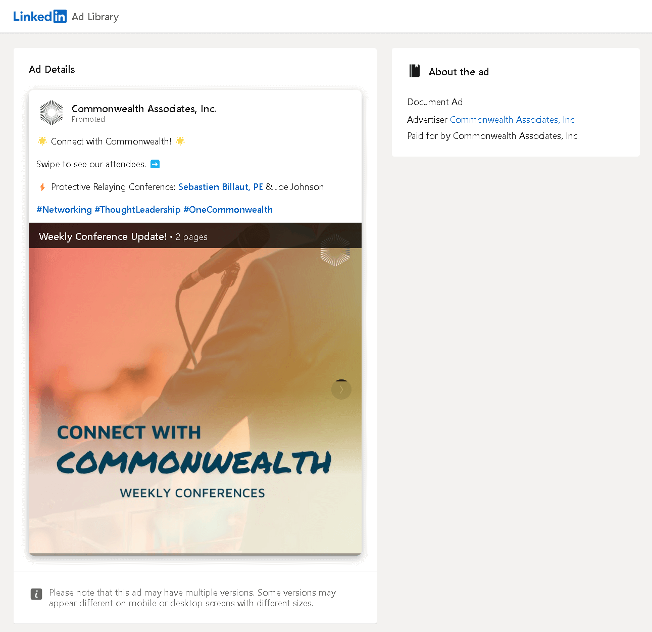
A captured Commonwealth Associates Document Ad is labeled as a two-page weekly conference update. Only its cover was accessible, so it is not a complete opening analysis or a performance example. It is still a useful boundary case: not every Document Ad even has a fourth page.
There is also one often-cited practitioner comparison. In a January 2023 article, Clix Marketing reported results from a client test of three preview pages versus five. The published table shows:
| Reported preview | Spend shown | Clicks | Leads | Recalculated CPL |
|---|---|---|---|---|
| 3 pages | $18,221.84 | 2,992 | 501 | $36.37 |
| 5 pages | $16,614.20 | 2,435 | 373 | $44.54 |
Using the five-page CPL as the comparison base, the three-page row is about 18.3% lower. The screenshot uses a dollar sign but does not state the account currency code or fee and tax basis. Its “CVR” also calculates as leads divided by clicks, not submissions divided by form opens.
That is useful evidence to justify testing preview length. It is not a universal rule. The Clix account does not report the run dates, randomization method, whether the documents and audiences were otherwise identical, or downstream lead quality. It compares preview packages, not the isolated effect of page-one, page-two, or page-three design.
So test two questions separately:
- Opening-content test: change the information architecture of pages one through three while holding the offer, later pages, preview count, form, targeting, objective, placement, and run window constant.
- Preview-boundary test: keep the document and offer identical, then change only where the preview ends.
Combining those changes may improve a campaign, but it cannot tell you which change did the work.
Put the Gate After a Complete Useful Unit
For a native lead-generation document, the gate should not be the place where the document finally becomes specific. The preview should let the reader complete at least one small task: diagnose a problem, classify a situation, understand the sample, compare two options, or identify the right section.
A practical gate check is:
- Before the gate: the reader can state one new conclusion or take one immediate action.
- At the gate: the continuation is concrete, not generic.
- After the gate: the document deepens, applies, repairs, or extends the completed unit; it does not merely reveal the answer that the preview withheld.
For an ungated document, use the same logic without the exchange. The opening still has to overcome feed friction, but page three can point directly to the next useful layer instead of selling access.
Worked Example: Diagnose, Repair, Then Handle the Exception
The following seven-page document is an original fictional teaching example for a made-up B2B brand, Relayfield. It contains no client data and claims no campaign result. The scenario is a sales-to-implementation handoff in which the delivery owner is named but the customer acceptance owner is missing.

| Page | Information job | What the reader receives | Why the next page exists |
|---|---|---|---|
| 1 | Identify audience, problem, and rule | Sales and implementation leads are told to name who accepts the first deliverable, not only who delivers it. | Inspect a filled handoff and test the rule. |
| 2 | Make the problem concrete | Outcome, delivery owner, acceptance evidence, and conditional date are filled in; the customer acceptance owner is explicitly missing. | Compare the reader’s diagnosis with the answer. |
| 3 | Complete the first useful unit | The document names the missing field and gives three actions: name one approver, confirm the check and conditional date, and avoid “the customer” as an owner. | See the repaired record and an exception branch. |
| 4 | Demonstrate the repair | Customer Operations Lead is named as the acceptance owner; the evidence and conditional date remain explicit. | Stress-test the record when an input is late. |
| 5 | Handle the exception | Friday becomes an export-format walkthrough, not production acceptance; the changed milestone remains proposed until the approver agrees. | Convert the decision into a message. |
| 6 | Supply usable copy | A complete milestone-change message preserves the original acceptance check and assigns the next action. | Transfer the method to another handoff. |
| 7 | Create repetition | A four-field checklist asks the reader to inspect an existing handoff. | The document ends with application, not another teaser. |
Here is the actual handoff that pages two through four diagnose and repair:
| Field | Before | Repaired record |
|---|---|---|
| Outcome | Export 12 agreed test orders with correct IDs, totals and status values. | Same outcome. |
| Owners | Implementation Lead delivers; customer acceptance owner is not named. | Implementation Lead prepares; Customer Operations Lead accepts. |
| Acceptance evidence | “The customer” checks all 12 records against the agreed columns. | Customer Operations Lead checks all 12 records and records approval. |
| Target | Friday, 3 p.m., provided test data arrives by Tuesday noon. | Same conditional date, agreed with the named approver. |
The repair makes responsibility explicit; it does not mean acceptance has already happened. If the test data misses Tuesday noon, page six supplies this complete proposed message:
Subject: Confirming the Friday milestone
Our acceptance check requires the 12 agreed test orders. That input did not arrive by Tuesday noon.
We propose using Friday, 3 p.m., for an export-format walkthrough—not production acceptance.
Customer Operations Lead: please confirm that change. Implementation Lead will propose a new acceptance date once test data and review time are confirmed.
The original acceptance check stays unchanged.
The named owner, unchanged check and proposed status make the continuation useful. A reader gets the diagnosis before the gate and a usable repair and exception response after it.
For a native Lead Gen Form version, pages one through three can be the preview. The reader gets a full diagnosis and immediate action before the form. Page four then earns its place by showing the repaired record, while pages five and six handle a realistic exception and communication task.
For an ungated version, all seven pages remain available. The same opening still works because its transition is specific and the later pages add distinct value.
Download the complete seven-page fictional example. This fictional document illustrates the information sequence; it is not a live LinkedIn ad or a performance test.
Check the Page at Feed Width, Not Only in the Design File
A PDF can pass a file specification and still be uncomfortable to read when reduced. Consider a simple illustration: a US Letter page is 612 points wide. If the whole page is scaled to 320 CSS pixels, the scale factor is:
320 / 612 = 0.523
Under that geometric reduction, 8-point type occupies about 4.18 CSS pixels, while 32-point type occupies about 16.73 CSS pixels. This is not a model of every device or LinkedIn layout, and CSS pixels are not physical device pixels. It simply shows why “the font looked fine in the PDF” is not a readability test.
Use a single-column layout, short line lengths, strong contrast, and one dominant idea per page. Then export the actual file, render each page at a representative narrow width, and inspect it without relying on zoom. LinkedIn’s current guidance likewise warns against small fonts, multicolumn copy, and low-contrast combinations.
Also remember that a drawn button inside the PDF is not a native interactive control. LinkedIn says links and CTAs are not clickable in the document player; links work after the file is downloaded. Put the real action in the ad configuration and treat any in-document CTA as post-download navigation.
Measure the Action You Actually Observed
A document view, a quartile event, a download click, a form open, and a lead are different events.
LinkedIn defines Lead Form Completion Rate as submitted forms divided by form opens, and Cost Per Lead as spend divided by leads. Its reporting schema defines document quartile and completion metrics as reaching those points, including by skipping. It defines downloadClicks as clicks expressing an intent to download, which may or may not produce an actual download. See LinkedIn’s lead metric definitions and the Ads Reporting field definitions.
Those definitions prevent a common diagnosis error. A lower form-completion rate does not necessarily mean fewer leads:
| Illustrative variant | Impressions | Media spend | Form opens | Submissions | Form completion rate | Leads per impression | CPL |
|---|---|---|---|---|---|---|---|
| A | 10,000 | $1,000 | 100 | 40 | 40% | 0.40% | $25.00 |
| B | 10,000 | $1,000 | 200 | 60 | 30% | 0.60% | $16.67 |
These are synthetic inputs, not benchmarks. Variant B has a lower form-completion rate but more leads and a lower CPL because more people opened the form. The table says nothing about reading, lead quality, sales, or which creative element caused the difference.
Before launching a test, write the primary event and denominator in full. For a lead-generation document, that might be form submissions per 1,000 impressions and CPL, with form opens, completion rate, and a predetermined lead-quality check as guardrails. For an ungated report, it might be document progression and download-intent fields, described exactly as LinkedIn defines them—not relabeled as “verified reads.”
The first three pages should make the document useful and coherent. Whether they improve continuation is a testable hypothesis, not something the page count proves.
The Practical Rule
Do not ask, “How do we fill three pages?” Ask, “What uncertainty should each opening page remove?”
Page one should identify the right reader and decision. Page two should prove there is substance. Page three should complete a useful unit and name the next one. Then place the preview boundary where the information exchange makes sense for the objective—not where a borrowed formula says it belongs.
That approach works with a gated survey report, an open technical paper, or a short two-page update. It also produces a cleaner experiment: you can test the opening package, test the preview boundary, and report the events the platform actually observed without pretending that a swipe, lead, or download proves a careful read.
Sources
- LinkedIn document ads — LinkedIn Marketing Solutions Help; last checked September 8, 2026.
- Document ads advertising specifications — LinkedIn Marketing Solutions Help; last checked September 8, 2026.
- Create document ads in Campaign Manager — LinkedIn Marketing Solutions Help; last checked September 8, 2026.
- Document ads best practices — LinkedIn Marketing Solutions Help; last checked September 8, 2026.
- Conversions and leads metrics in Campaign Manager — LinkedIn Marketing Solutions Help; last checked September 8, 2026.
- Metrics Available in LinkedIn Ads Reporting — LinkedIn / Microsoft Learn, API view
li-lms-2026-08; last checked September 8, 2026. - The Strategies & Effectiveness of Influencer Marketing — 2022 Report: From the Brand Perspective — GRIN; report year 2022, underlying survey period 2021.
- GRIN Document Ad capture — GRIN creative reproduced by ZenABM; campaign date not stated.
- Large Language Models in Finance — LSEG Data & Analytics / Probability & Partners; publication date not stated.
- LSEG Document Ad capture — LSEG creative reproduced by ZenABM; campaign date not stated.
- Commonwealth Associates Document Ad capture — Commonwealth Associates creative reproduced by Circleboom; capture available by May 2024.
- LinkedIn Document Ads Tips + Performance Data and its three-page versus five-page table — Clix Marketing, January 10, 2023.