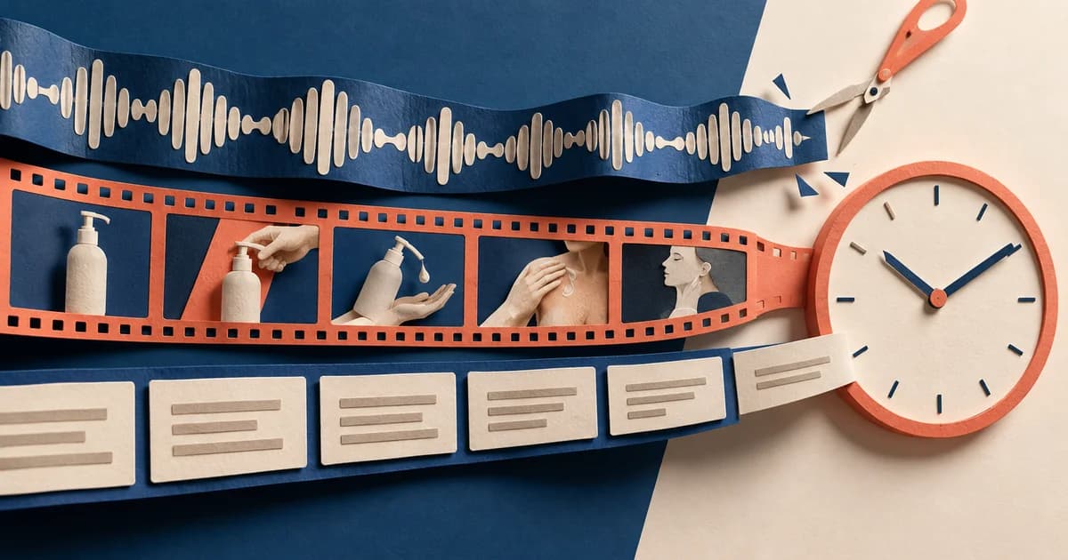
A sponsor gives you one product message. A remote-work newsletter is discussing the workday spilling into dinner. A developer digest is sorting a backlog of pull requests. A creative newsletter is asking readers to study why an image caught their attention. Should the same ad appear in all three?
The product facts can stay the same. The opening problem, vocabulary, level of detail, and visual treatment usually should not.
That is what it means for a newsletter ad to belong in the email: it helps with the task already occupying the reader without pretending to be independent editorial advice. The paid relationship should be obvious before the reader has to interpret the pitch. The claims should remain true. The call to action should lead somewhere that delivers what the copy promises.
This article examines real newsletter placements, then applies the lessons to three complete fictional sponsor blocks. None of the observed examples establishes higher trust, clicks, or conversions. They show creative choices—not controlled performance results.
Read the placement, not just the sponsor block
A cropped ad can show typography and copy. It cannot show whether the placement fits the email.
Before adapting a sponsor message, read the issue in this order:
- What did the reader come here to do? Catch up on technical releases, find remote jobs, study creative references, or make a business decision?
- What is the paragraph immediately before the ad doing? Opening a problem, ending a list, shifting sections, or pausing a long essay?
- What happens immediately after it? Does the newsletter return to the same topic, begin a new category, or need a visible boundary so advice is not attributed to the sponsor?
- Where is the paid status disclosed? A masthead sponsor credit does not automatically make a later block easy to identify in context.
- What does the click promise? The destination is part of the ad, not an administrative detail added after copy approval.
An intentionally separate block can fit better than close imitation. In Jane Friedman’s archived Electric Speed issue, a personal introduction is followed by an “ISSUE SPONSOR” section, then by the newsletter’s own recommendation list. That next section explicitly says the resources are not paid mentions or affiliate links. The sponsor is relevant to an audience of writers, but the structure does not require the ad to masquerade as Jane’s independent recommendation. See the full Electric Speed issue, not just the sponsor copy.
The useful question is therefore not, “Does this sound exactly like the editor?” It is, “Does this make sense at this point in the reader’s journey, with a clear paid boundary?”
Change the reader’s problem, not the product truth
Sunsama provides a useful real-world comparison because archived placements show the same planning product in three different newsletter contexts. The examples ran on different dates and were not a controlled campaign, so they cannot tell us which version performed best. They can show what each publisher chose to foreground.
| Newsletter context | Immediate reading job | How the Sunsama message was framed |
|---|---|---|
| Every / Napkin Math, December 15, 2022 | Follow a reflective business essay about reviewing predictions and deciding what deserves attention | The placement emphasizes regaining control from email, Slack, and calendar demands, with integrations supporting the focus story. |
| Remotive, January 30, 2023 | Read remote-work links and find a healthier way to structure the workday | The sponsor section leads with work-life balance, then makes planning concrete through tasks, time, family, and exercise. |
| Tech Productivity issue 239, September 11, 2023 | Consider unfinished projects, browse productivity tools, and follow a linked personal account of burnout | The copy stresses bringing tasks, meetings, and email into one plan, then names interface details such as a focus bar and timer. The same body also appears again inside the tools list. |
The product category did not change. The reader’s immediate problem did. Every gets an attention-and-control frame. Remotive gets a boundary-between-work-and-life frame. Tech Productivity gets a tools-and-workflow frame.
That does not mean every sponsor message needs a total rewrite. CodeRabbit offers a useful counterexample from two developer newsletters published on the same day. In JavaScript Weekly issue 800, the placement sits among technical links and leads with the operational idea of not reviewing pull requests merely in arrival order. In Bytes issue 517, the same Triage proposition is packaged under the playful section title “Our Friends (With Benefits)” and paired with a flood image and a backlog metaphor. The technical core remains recognizable; the rhythm and visual metaphor change.
That pair suggests a practical rule: rewrite only where the reading context gives you a reason.
| Control deliberately | Adapt to the issue |
|---|---|
| Product capabilities and limitations | The reader problem named in the first sentence |
| Evidence behind factual claims | Vocabulary and examples |
| Offer terms and eligibility | Which true details receive priority |
| Who is speaking and what experience they can honestly claim | Sentence length, pace, and humor level |
| Paid identification | Whether the block is text-led, image-led, or intentionally separate |
| CTA promise and actual destination | The transition into and out of the placement |
A familiar tone is not proof of trust. A polished execution is not proof of performance. Treat “fit” as an observable editorial judgment: the sponsor addresses a live reader task, uses details appropriate to that task, and returns the reader to the newsletter without creating a false claim or a false speaker.
Keep the paid boundary local and unmistakable
The strongest contextual opening can become confusing if the reader must investigate whether it is advertising.
The US Federal Trade Commission’s Native Advertising guide, published in 2015 and still available as staff guidance, says the overall presentation and net impression matter. It explicitly covers promotional content delivered in email. When a disclosure is necessary, the guide focuses on clarity, prominence, and proximity to the ad’s focal point; it also warns that a disclosure placed after a headline may arrive too late. The guide does not provide one magic label that guarantees compliance in every design.
For a newsletter production team, that translates into a few concrete choices:
- Put the paid identification immediately before or beside the sponsor headline, not only at the top of a long issue.
- Keep it as live, readable text rather than embedding the only disclosure in a logo or image.
- Check that the label and headline remain together on a narrow screen.
- Make the transition back to editorial content visible when the next paragraph could otherwise be read as part of the pitch.
- Do not use a joke, logo, or “partner” phrasing as a substitute for assessing the whole presentation.
The speaker matters just as much as the label. The FTC’s Endorsement Guides FAQ explains that prewritten content is not automatically the problem; the represented experience and opinion must still be truthful. A sponsor can supply a draft. It cannot manufacture an editor’s experience.
So a sentence such as “I use this every morning” belongs only when the named speaker actually does and the publisher is prepared to stand behind that statement. Otherwise, write in the sponsor’s or product’s voice: “Gatherboard lets you save…” rather than “I save…”
Three common failures follow from ignoring this boundary:
- The label is technically present but visually remote. A large image separates “Sponsored” from the headline. Move the label closer and repeat identification where the reading path needs it.
- The copy borrows an endorsement the writer never made. Replace first-person experience with a factual product statement or a properly sourced testimonial.
- The ad absorbs nearby editorial advice. Add an end marker, divider, or stronger section change so the next recommendation is not mistaken for a product capability.
Clear separation is not the enemy of fit. It can be the mechanism that lets a relevant sponsor participate without confusing authorship.
Write to the publisher’s actual production rules
“Keep it short” is not a usable brief. Newsletter publishers accept different units, count different things, and assign different levels of editorial control.
The following first-party pages were checked on September 8, 2026. They are examples of incompatible workflows, not an industry standard:
| Publisher | Who shapes the copy? | Selected production constraints |
|---|---|---|
| TLDR | TLDR says it can write the ad from bullet points and a landing page in its editorial style. | Its specifications allow up to 30 words for Quick, 50 for Secondary, and 100 for Primary units, with one, two, and three calls to action respectively; Primary also includes a logo. |
| Cooperpress | The publisher reviews material for format and tone and sends a visual proof. | A Primary Sponsorship uses an ideally 20–60-character title and 100–250-character body, with specified static image sizes. Sponsored links receive a local sponsored tag. These are described as ideal ranges, not universal hard limits. |
| Jane Friedman | The advertiser normally supplies finished copy; the publisher says it generally does not revise it except for length or compliance. | Body copy is limited to 360 characters including spaces; one URL is embedded in two places; a supplied image is 2:1 and at least 1000×500 pixels, with alt text. |
| Morning Brew | Its terms describe custom material, advertiser comments, and approval timing. | Unit-specific word limits are 150 for Presenting units—120 in Morning Brew itself—50 for Brand Booster, 20 for Direct Response, and 35 for Resource Roundup. The insertion order can control. |
| ChannelPro | The public page specifies supplied creative fields. | Its Standard Newsletter Sponsorship lists a 30-character headline and 150-character promotional message, both counted without spaces; Premium allows a 200-character message. |
The differences change the assignment before anyone writes a clever opening. Ask five questions at kickoff: Who writes the final copy? Which exact unit was bought? Does the platform count spaces? Does the CTA live inside the body field? Who approves the final proof?
Here is a concrete counting example using the fictional product introduced below.
Version for a 360-character body field, CTA included:
Gatherboard keeps web links and your notes together in a project board. Capture what caught your eye, then share a read-only link with someone reviewing the references. Explore an ungated example. View the sample board.
That body is 35 words and 219 characters including spaces under a simple plain-text count. It has numerical room under Jane Friedman’s public 360-character body limit, but that does not equal publisher approval; the actual field counter and all other specifications still control.
Compact version for fields counted without spaces:
Keep links in context
Save links with notes in Gatherboard. Organize them in a project board and share a read-only link. View the sample board. No signup required.
The headline is 18 characters without ASCII spaces, and the body is 118. That fits ChannelPro’s published 30/150 numerical fields with room to spare. Again, this verifies the count—not acceptance, rendering, or campaign performance.
The point of counting is not to fill every available character. It is to preserve the most useful truth when the unit changes.
One fictional product, three complete sponsor placements
The following examples are original teaching material, not live ads or publisher endorsements. Gatherboard is fictional. Its fixed facts are deliberately narrow: it saves a web link with a short note, organizes sources in a project board, shares a read-only board link, and offers a sample board that can be viewed without signup.
All three placements use the same disclosure, offer, CTA, and fictional destination:
- Disclosure: Advertisement · Paid for by Gatherboard
- CTA: View the sample board
- Destination:
https://gatherboard.example/sample
Only the reader’s immediate job and the presentation change.
Example 1: A developer briefing
Editorial before
Before comparing libraries, write down the constraint each option must satisfy. A link is easier to evaluate when you know which decision it is meant to support.
Sponsor block
Advertisement · Paid for by Gatherboard
Keep the reason beside the link
Comparing libraries? Save each reference in Gatherboard with a short note about the constraint it addresses. Organize those links in a project board, then share a read-only view with your team. Explore an ungated sample before deciding whether it fits.
View the sample board —https://gatherboard.example/sample
End of advertisement
Editorial after
Next in the reading queue: a practical checklist for reviewing an unfamiliar repository. Start with the build instructions, then inspect the test setup.
Why it fits: The opening continues the real decision in progress: why one library deserves consideration. It does not pretend Gatherboard reviews code, assigns tasks, or chooses a library. The body is 40 words. The placement can remain text-only because the link, note, board, sharing mode, offer, and disclosure are all understandable without an image.
Example 2: Creative field notes
Editorial before
This week’s references share one detail: an ordinary object becomes interesting through the way it is framed. Keep a note about what caught your eye, not just where you found it.
Sponsor block
Advertisement · Paid for by Gatherboard
Save what caught your eye
A reference can be more than a picture you liked. In Gatherboard, save the web link and add a short note about the framing, texture, or idea you want to revisit. Keep the observation attached to its source. Group those references in a project board and share a read-only link when the collection is ready for another pair of eyes. The sample board is open to explore, with no signup required.
View the sample board —https://gatherboard.example/sample
End of advertisement
Editorial after
For the next exercise, describe one visual choice without using the words beautiful or inspiring. Name the choice another maker could actually try.
Why it fits: The same saving function is framed as observation rather than technical evaluation. The sentences slow down, and details such as framing and texture belong to the surrounding exercise. The copy still says the saved item is a web link; it does not invent image upload, AI moodboards, or creative generation. The body is 71 words.
Example 3: A team handoff memo
Editorial before
A useful handoff explains why a reference matters and what is still undecided. Sending a folder of links does not tell the next person which question each link answers.
Sponsor block
Advertisement · Paid for by Gatherboard
Send context, not just links
The next person needs more than a stack of URLs. Gatherboard lets you save web links with short notes, organize them in a project board, and share a read-only link. Add the reason each resource belongs in the handoff. View an ungated sample board before deciding whether to use it.
View the sample board —https://gatherboard.example/sample
End of advertisement
Editorial after
In your next handoff, separate the decisions already made from the questions still open. Put the owner of each open question in the first line.
Why it fits: This version addresses context loss during a handoff. It is intentionally set off as a sponsor card rather than written as the editor’s personal tool recommendation. The next editorial sentence mentions an owner, but the ad does not turn that nearby advice into a nonexistent automatic-assignment feature. The body is 50 words.

The comparison works because the factual core is constrained. The developer version selects “constraint” and “decision.” The creative version selects “framing,” “texture,” and “idea.” The handoff version selects “next person” and “reason.” None earns its tone by adding a discount, a guarantee, or a feature that Gatherboard does not have.
Use that discipline on a real brief: make a fixed-facts sheet first, then permit contextual variation only inside those boundaries.
Check the destination and the text-first version
A sponsor message is not finished when the paragraph is approved.
First, resolve the exact destination. Open the final tracked URL, not merely the clean domain in the brief. Confirm that the visible landing page supports the same product, action, audience, and offer named in the ad. An archived placement may preserve an old trial period or a tracker that no longer resolves; neither is evidence of the offer a reader will see today. During this research, the archived CodeRabbit placements exposed the Triage topic clearly, while the shared tracking destination did not resolve. The current official Triage documentation verifies the product subject, but it does not retroactively establish the old tracker’s final landing page.
Second, separate two representation checks that are often collapsed into one:
- Images off in an HTML email. Microsoft documents that classic Outlook can block automatic downloads of external pictures. That is a product-specific behavior, not a claim about every inbox. It is enough reason not to place the only sponsor label, offer, or CTA inside an image.
- A plain-text counterpart. Mailchimp explains that a plain-text email contains no images or rich formatting and that tracking can transform visible links into redirect URLs. A good HTML layout with its images disabled is therefore not the same test as reading the generated text version.
For the three Gatherboard examples, the required reading order is explicit: editorial context, paid label, sponsor headline, body, CTA with visible destination, end marker, then editorial content. Use the full-context examples to check the reading order at a narrow width, then test your real placement in its intended email clients. Browser layout alone cannot establish inbox rendering or deliverability.
Before approving a newsletter ad, run this final check:
- Read the paragraph before and after the placement.
- Name the one immediate reader task the ad addresses.
- Lock the product facts, evidence, offer, and prohibited claims.
- Identify who is speaking; remove any experience they cannot truthfully claim.
- Put a clear paid label next to the sponsor headline in live text.
- Adapt the lead, detail order, rhythm, and imagery—not the truth.
- Count the exact fields using the publisher’s unit and counter.
- Open the final tracked destination and inspect mobile, images-off HTML, and the actual plain-text output separately.
A newsletter ad belongs when it respects both sides of the placement. It understands why the reader opened the email, and it makes no attempt to hide why the sponsor is there.
Sources
- Should You Fire This Newsletter? — Every / Napkin Math, published December 15, 2022; archive shows a July 10, 2026 update.
- Elon Musk Is Now a Fan of Remote Work — Remotive, January 30, 2023.
- Tech Productivity Issue #239 — Tech Productivity, September 11, 2023.
- JavaScript Weekly Issue 800 — Cooperpress / JavaScript Weekly, September 1, 2026.
- Bytes #517: 100 years of htmx — Bytes, September 1, 2026.
- [Electric Speed] Life-changing nonfiction — Jane Friedman / Electric Speed; send date not shown in the public archive.
- Native Advertising: A Guide for Businesses — Federal Trade Commission, December 22, 2015.
- FTC’s Endorsement Guides: What People Are Asking — Federal Trade Commission; references the Endorsement Guides revised in 2023.
- Newsletter Advertising Best Practices — TLDR.
- Our Email Newsletter Sponsorship Specifications — Cooperpress, last updated June 2025.
- Making the Most of Your Sponsorship — Jane Friedman.
- Additional Terms & Conditions — Morning Brew.
- Online Creative Specifications — The ChannelPro Network.
- Triage — CodeRabbit documentation.
- Block or unblock automatic picture downloads in classic Outlook email messages — Microsoft Support.
- Create a Plain-Text Email — Mailchimp.