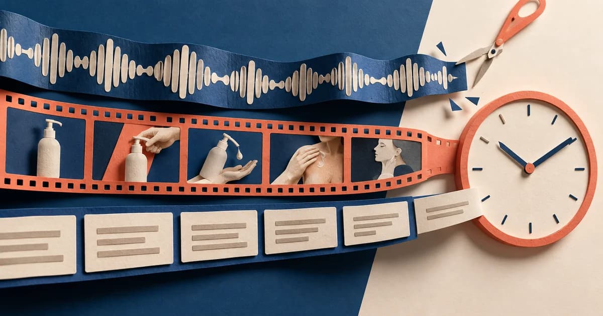

A six-second bumper fails when it is treated as a 30-second commercial on fast-forward. The product enters, three benefits flash, a testimonial appears, a discount shouts over the music, and the logo arrives just as the file ends. Everything is technically present. Nothing has time to become an idea.
The better brief is smaller: show one subject, make one change happen, and finish with one branded consequence. A reading light turns darkness into a readable page. A pouch unfolds into a grocery bag. A swarm of notifications collapses into one timer. The viewer should not need to reconstruct the message after the ad is over.
Google Ads currently describes bumper ads as non-skippable videos that play before, during, or after other videos. Its format page lists them at five to six seconds and says they use Target CPM bidding; its Video reach guidance classifies bumper assets as videos up to six seconds. Video ad content must be hosted on YouTube, even when it can also serve across eligible Google video partner inventory. See Google Ads Help on video ad formats and Video reach campaigns.
Non-skippable does not mean automatically noticed, understood, or remembered. It only removes the skip control. Creative still has to make the six seconds legible.
This guide includes five original, fictional storyboards and five working animatics. Every animatic is exactly 6.000 seconds, 180 frames at 30 frames per second. They are teaching examples, not live campaign examples and not evidence of brand lift, recall, or sales performance.
What a six-second bumper has to finish
A bumper does not need to finish the entire customer journey. It does need to finish its own sentence.
A useful sentence has three parts:
- Subject: What are we looking at?
- Change: What happens?
- Consequence: Why does that change matter, or what should the viewer remember?
That creates a practical structure:
Setup → change → result → branded hold
The structure is not a platform rule. It is a production scaffold that keeps a team from spending five seconds on setup and then asking the final second to carry the product, promise, logo, offer, and call to action.
| Working time range | Creative job | The test before you approve it |
|---|---|---|
| 0.00–0.70 | Orient the viewer and place a brand or product cue | Can someone name the subject from a paused frame? |
| 0.70–2.30 | Start one action or transformation | Is there one dominant verb rather than several cuts competing for attention? |
| 2.30–4.70 | Let the visible consequence register | Could the message still be understood with the voice-over muted? |
| 4.70–6.00 | Hold the branded conclusion | Is the final line a conclusion, not a new claim? |
Google’s ABCD guidance for YouTube creative makes compatible recommendations: get to the heart of the story quickly, use audio and on-screen text as reinforcement rather than competition, introduce the brand or product from the start, keep the message focused, and make any requested action explicit. Those are guidelines, not a guarantee of results, but they are a useful review lens. See About the ABCDs of effective video ads.
The central discipline is subtraction. A complete bumper can communicate “this clip light solves night reading.” It cannot also explain brightness modes, battery life, color options, shipping, reviews, and a launch discount without turning the message into a checklist.
Five original bumper ad examples, timed frame by frame
The five concepts below use fictional brands and original vector artwork. Each solves a different production problem: a physical demonstration, a transformation, an app-state simplification, an audio-visual contrast, and an event reminder. Download the storyboard PNG or play the six-second MP4 to inspect the timing directly.
1. LumaClip: make the product action the story

Play the LumaClip six-second animatic
Complete idea: A dark page becomes readable when one clip light snaps on.
| Time | Picture | On-screen copy | Sound | Job |
|---|---|---|---|---|
| 0.00–0.70 | Dim open book; the light waits at frame edge; LumaClip is already present | “LIGHTS OUT?” | Low room tone | Name the situation immediately |
| 0.70–1.60 | The light moves in and clamps onto the page | None | Tactile click | Give the product one clear verb |
| 1.60–4.60 | A warm cone opens and the page becomes readable | “CLIP. TAP. READ.” | Warm chime, then a page flick | Make the result visible and reinforce it in three beats |
| 4.60–6.00 | Product and final line on a clean field | “READ PAST LIGHTS-OUT.” | Short confirmation tone | Turn the demonstration into a branded takeaway |
This works as a bumper because the product is not introduced and then explained; the introduction is the explanation. The light crosses the frame, attaches, and changes the scene. Even without the copy, the viewer can infer the basic job. The copy does not add a second promise. It names the action already on screen.
A longer version might discuss brightness settings or charging. Those details do not belong here. Adding them would force the visible proof to compete with specifications. The six-second version owns one claim-shaped idea: light where a reader needs it.
2. Foldline: use one transformation instead of three benefits

Play the Foldline six-second animatic
Complete idea: A pouch unfolds into a full tote, then proves its job by taking groceries.
| Time | Picture | On-screen copy | Sound | Job |
|---|---|---|---|---|
| 0.00–0.80 | A small branded pouch sits in a pocket | None | Soft pocket pop | Establish the surprising starting scale |
| 0.80–2.70 | Fabric panels unfold into a tote | None | Rising cloth whoosh | Let the transformation occupy the middle |
| 2.70–4.70 | An apple, bottle, and loaf drop into the open bag | None | Three soft impacts | Clarify that the transformed object is usable, not decorative |
| 4.70–6.00 | Tote and pouch resolve into a simple packshot | “A BAG IN YOUR POCKET.” | Finish snap | State the contrast the viewer just saw |
The temptation is to label the bag “lightweight,” “reusable,” “strong,” and “compact.” The transformation already communicates compactness. The grocery drops clarify function. A list would not strengthen those images; it would ask the viewer to read while the most useful proof is happening.
The final line works because it closes the contrast between first frame and last frame. It does not suddenly introduce sustainability, capacity, or an offer. One visual transformation supports one verbal conclusion.
3. Pomo: turn an interface tour into one state change

Play the Pomo six-second animatic
Complete idea: Notification clutter collapses into one 25-minute focus session.
| Time | Picture | On-screen copy | Sound | Job |
|---|---|---|---|---|
| 0.00–1.30 | Four notification cards crowd the screen | “EMAIL 12,” “CHAT 8,” “MEETING NOW,” “UPDATE 3” | Four distinct pings | Make the problem readable without exposition |
| 1.30–2.50 | One focus button is pressed; the cards collapse inward | None | Low whoosh | Use a single input to change the visual system |
| 2.50–4.60 | A large timer settles at 25:00, then begins | “WRITE THE OUTLINE” | One clean chime | Show the product state that matters |
| 4.60–6.00 | Timer becomes a bold “25” icon beside the conclusion | “ONE TASK. 25 MINUTES.” | Short tonal resolve | Name the method, not the whole app |
Software bumpers often become unreadable because the team tries to preserve the product tour: dashboard, menu, settings, integrations, analytics, and mobile screen. Pomo removes the tour. The creative shows a before state, one tap, and an after state.
The task label—“Write the outline”—is deliberately ordinary. It helps the timer feel like a tool in use rather than an abstract clock. Yet it remains secondary to the dominant idea. The ad is not promising that the app eliminates distraction; it is dramatizing a focused session as the product experience.
4. QuietKey: let sound and picture perform the same contrast

Play the QuietKey six-second animatic
Complete idea: A jagged commute waveform flattens when an earbud clicks in.
| Time | Picture | On-screen copy | Sound | Job |
|---|---|---|---|---|
| 0.00–1.30 | Train windows move behind a large, unstable waveform | “THE TRAIN.” | Rumble and hiss | Establish noise through two channels at once |
| 1.30–2.30 | One earbud clicks into the center of the waveform | None | Tactile click | Make the causal moment unmistakable |
| 2.30–4.50 | The waveform settles while the train keeps moving | “NOISE DOWN” | Rumble drops; soft tone enters | Preserve the environment while changing the experience |
| 4.50–6.00 | A pair of earbuds and the final line fill the frame | “COMMUTE. MUTED.” | Calm tonal finish | Compress the benefit into a two-beat mnemonic |
This example demonstrates why audio should reinforce, not rescue, the picture. A listener hears the change, but a muted viewer also sees the waveform settle. Neither channel carries a separate claim.
The train continues moving after the click. That continuity matters: cutting to a silent white studio would be a new scene, not a visible contrast. Keeping the environment stable makes the product action easier to understand.
For a real campaign, “noise down” and “muted” would need to match the product’s substantiated capabilities and local advertising rules. The fictional animatic demonstrates structure, not proof of a technical specification.
5. Nightjar Market: make the date the payoff

Play the Nightjar Market six-second animatic
Complete idea: A moon becomes a lantern, revealing an event and its exact time.
| Time | Picture | On-screen copy | Sound | Job |
|---|---|---|---|---|
| 0.00–1.40 | Crescent moon transforms into an orange market lantern | None | Night ambience and a bell | Build a simple visual mnemonic |
| 1.40–3.40 | Three stalls and small figures pop into place | None | Three rhythmic pops | Reveal what kind of event this is |
| 3.40–5.20 | A dark plate covers the center; date and time dominate | “FRIDAY” / “7 PM” | Two-beat date sting | Give the operational information the largest type |
| 5.20–6.00 | Lantern, brand, venue, date, and time resolve together | “NIGHTJAR MARKET” / “RIVER YARD • FRIDAY • 7 PM” | Final bell tone | Repeat the facts someone must remember |
Event ads commonly spend too long creating atmosphere and leave the date as small end-card copy. Nightjar reverses that hierarchy. The transformation earns attention, the stalls establish context, and the date becomes the payoff. The final hold repeats rather than expands.
There is no “don’t miss it,” “food, music, and makers,” ticket instruction, sponsor row, or hashtag. Those may belong on the landing page or in a longer asset. The bumper’s job is simpler: connect a distinctive lantern with one place and one time.
How to shorten a long ad without speeding it up
Start by separating the campaign brief from the bumper brief. A campaign can contain several messages. One bumper should usually own one of them.
Consider this fictional 20-second bottle script:
Meet TrailSip, the insulated, leak-resistant bottle with a wide mouth, carry loop, two sizes, and six colors for work, workouts, and weekends.
Trying to read all 22 words in six seconds requires 220 words per minute before pauses, product sounds, or a final hold. The mathematical problem is visible: 22 words ÷ 6 seconds × 60 equals 220 words per minute. Even if a voice actor can say it, the viewer still has to decode the picture and copy at the same time.
A bumper version should choose one demonstrable idea:
Picture: TrailSip turns upside down inside a tote; the papers beneath stay dry.
Copy/voice: “Bag dry. Keep moving. TrailSip.”
That version does not summarize the entire bottle. It completes one product thought.
Use this reduction sequence:
- Circle the one thing the viewer should repeat afterward. Not “everything about the product”; one sentence.
- Choose a verb that can be filmed or animated. Clips, unfolds, silences, pours, locks, reveals, arrives.
- Cut claims the picture cannot help carry. A bumper has no spare time for unsupported adjectives.
- Move secondary facts elsewhere. Longer video, product page, companion creative, description, or another bumper can do a different job.
- Write the final frame last. It should name the consequence already earned by the action.
A useful warning sign is the word and. “Show the product and the founder and the offer and the app and the logo” is not a six-second idea. It is a media plan hiding inside a storyboard.
A filled bumper worksheet—and a blank version
Before opening an editing timeline, write the concept in one row. Here is the filled LumaClip version:
| Field | Filled answer |
|---|---|
| Audience moment | Someone wants to keep reading after the room light is off |
| One-sentence idea | A clip light turns a dark page into a readable page |
| Subject | Open book and clip light |
| One verb | Clips on |
| Visible consequence | The page brightens |
| Brand cue | LumaClip bug from frame one; yellow light shape |
| Final line | “Read past lights-out.” |
| What is deliberately omitted | Brightness modes, charging, price, colors, reviews, CTA |
Copy this blank version for a new concept:
Audience moment:
One-sentence idea:
Subject:
One verb:
Visible consequence:
Brand cue present from:
Final line:
What is deliberately omitted:

0.00–0.70  Setup:
0.70–2.30  Change:
2.30–4.70  Result:
4.70–6.00  Branded hold:
Do not advance to production if “one-sentence idea” requires a semicolon or several clauses. That is usually evidence that the team has not chosen the bumper’s job yet.
Export and QA: measure the file, not the intention
Google’s current Video reach specifications recommend 1080p assets—1920 × 1080 for horizontal, 1080 × 1920 for vertical, and 1080 × 1080 for square—and also accept 720p horizontal at 1280 × 720. The same guidance lists bumper duration as up to six seconds. See Video reach campaigns. The downloadable teaching animatics in this package use 1280 × 720 to keep the archive practical; a campaign master should generally use the highest clean source resolution appropriate to the placement.
YouTube’s upload guidance recommends an MP4 container, H.264 video, progressive scan, 4:2:0 chroma subsampling, and AAC-LC or Opus audio at 48 kHz. It also says to upload at the same frame rate in which the content was recorded or created. See YouTube recommended upload encoding settings.
Run a mechanical check before a subjective creative review:
| Check | Pass condition |
|---|---|
| Duration | The exported container reports 6.000 seconds or less for the intended bumper use |
| Frame count | At 30 fps, a six-second master contains 180 frames |
| First frame | No accidental black, slate, or one-frame flash; the subject is already legible |
| Brand presence | Product, logo, name, or distinctive brand cue appears from the opening rather than arriving as an unrelated tag |
| Text load | Each line can be read at the size and exposure time actually exported |
| Final hold | The conclusion remains stable long enough to register; the examples use roughly 0.8–1.5 seconds |
| Sound-off comprehension | The central change is visible, even when audio is unavailable |
| Sound-on reinforcement | Effects, music, and voice support the same idea rather than adding a second script |
| Claims and offers | Every product statement, price, date, deadline, and qualifier is verified for the live campaign |
| Decode | The delivered file opens and decodes without errors before upload |
The included animatic validation report records the measured result for all five files: 6.000 seconds, 180 frames, 30 fps, 1280 × 720, H.264 video, AAC stereo audio at 48 kHz, and a completed FFmpeg decode test.
Google Ads can determine the video ad format from the supplied YouTube video’s duration during campaign creation, and its current setup instructions identify videos up to six seconds as bumpers. The interface also asks for campaign details such as the final URL, display URL, optional CTA, and Target CPM bid. Those buying fields should not be mistaken for permission to force all of that information into the video frame. See Create a Video reach campaign.
The final edit is usually a deletion
A six-second bumper is not a tiny container for a full commercial. It is a complete unit with a narrow job.
Name one subject. Give it one verb. Let the result remain on screen long enough to become clear. Then use the final hold to brand the conclusion—not to introduce the fourth idea the team could not bear to cut.
That is how six seconds stops feeling like a deadline and starts functioning like a format.
Sources
- About video ad formats — Google Ads Help. Bumper duration, non-skippable behavior, placements, hosting, and Target CPM description. Checked September 9, 2026.
- Video reach campaigns — Google Ads Help. Current campaign composition, accepted bumper duration, orientations, resolutions, formats, and file-size guidance. Checked September 9, 2026.
- Create a Video reach campaign — Google Ads Help. Campaign flow, automatic format determination by video duration, required ad fields, and Target CPM step. Checked September 9, 2026.
- About the ABCDs of effective video ads — Google Ads Help. Attention, Branding, Connection, and Direction creative guidance. Checked September 9, 2026.
- YouTube recommended upload encoding settings — YouTube Help. MP4, H.264, progressive scan, frame-rate, chroma, audio, and bitrate recommendations. Checked September 9, 2026.