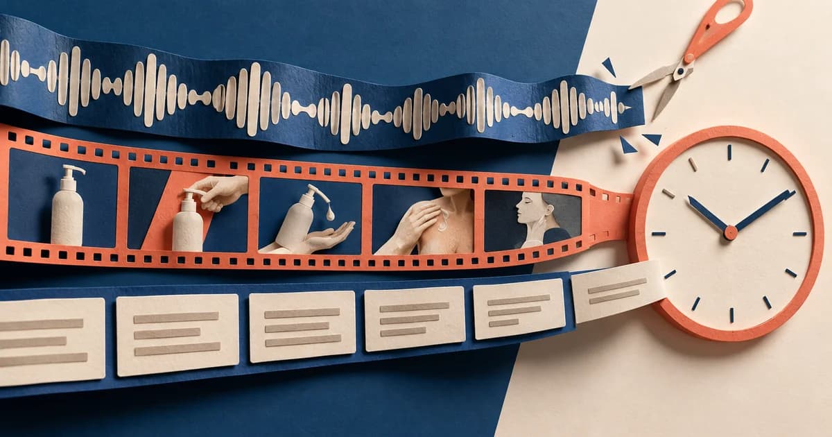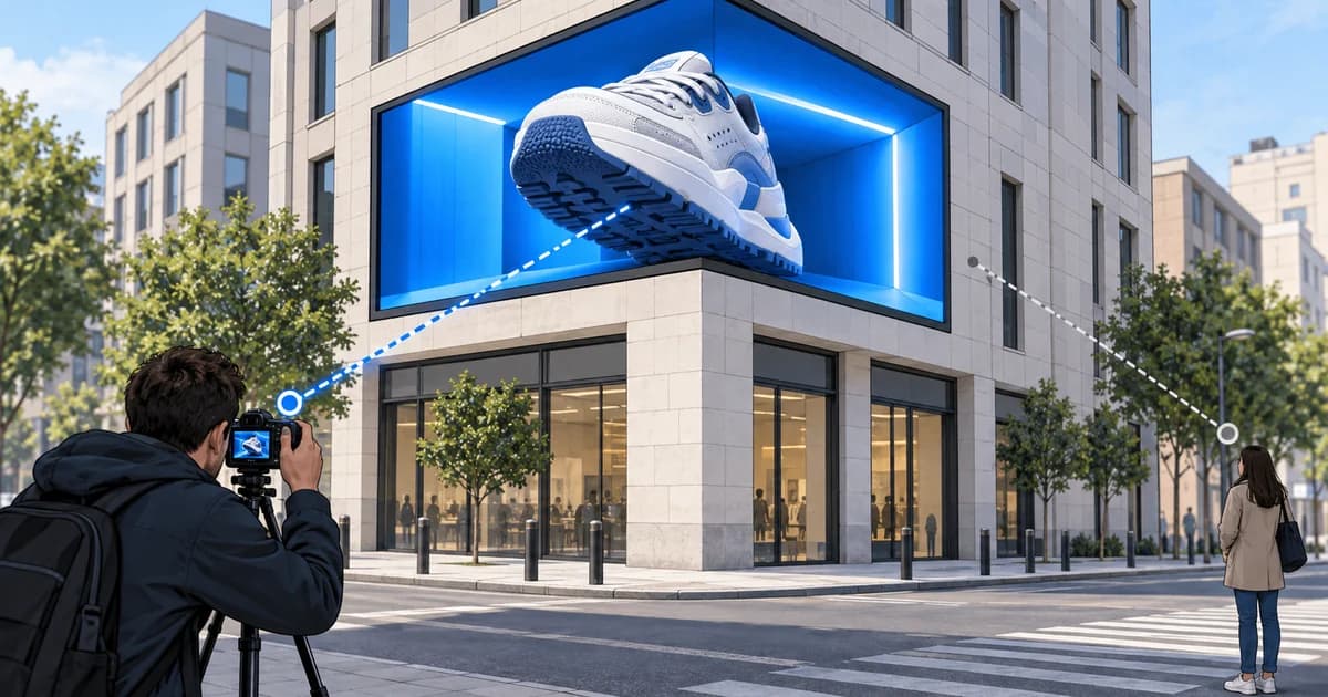
A product video can look persuasive and still produce a broken shopping experience. Imagine a fictional 12-second clip that shows a sage-green kettle pouring cleanly into a cup. The viewer taps the product label, but the destination is a general cookware collection. After another search, the product page opens on the black kettle. Sage is unavailable, the price is higher than the one shown in the video, and the selected finish disappears again in the cart.
The video did its job. The journey did not.
The useful way to review shoppable video examples is therefore not to rank the prettiest clips. Follow one tap through four states: the product cue in the video, the tappable product object, the product-detail state, and the checkout state. At every transition, ask whether the same item, variant, price context and shopper intent survived. A strong example makes the next action obvious and removes decisions the viewer has already made. A weak one uses the word “shoppable” for a video that merely sends traffic somewhere near the product.
This article compares documented platform journeys, then works through five original teaching examples. It also includes a downloadable working demo in which a timed product point opens a product detail, carries a selected finish and quantity into a simulated checkout, and creates no real order.
The example is the whole journey, not just the clip
A shoppable video contains two systems that are easy to evaluate separately and dangerous to separate in production. The creative system decides what the viewer sees, when the product becomes identifiable and what action the overlay invites. The commerce system decides which catalog object opens, which variant is available, what price is current and where checkout occurs.
Treat the connection between them as a continuity contract:
- Identity: The item shown and the item opened must be recognizably the same product.
- State: A selected color, size, pack, subscription option or quantity should persist when the platform supports it.
- Commercial truth: Price, availability, shipping and offer language need a defined source of truth and a refresh owner.
- Interaction: The tap target must remain usable around captions, player controls and other platform interface elements.
- Destination: The team must know whether the shopper stays in the platform, sees an intermediate product panel, opens a retailer site, or lands on a marketplace detail page.
That final point changes the creative brief. “Tap to shop” is incomplete direction because the tap can start very different journeys. A producer needs the exact destination type before locking copy, timing and framing.
Three documented platform journeys to compare
The following comparison describes documented product paths, not a claim that every viewer, market or account sees an identical interface. Platform eligibility, placement and product availability can change; verify the live setup before launch.
| Platform journey | What the product tap can do | What the creative team should verify |
|---|---|---|
| TikTok Shop video | TikTok’s March 2026 Video Shopping Ads guidance says in-feed videos can let people browse and buy products on TikTok Shop. Its branding-ad CTA guidance separately documents buttons that go to a product detail page or Products tab, and product anchors that open a product detail page on screen. | Confirm the connected shop, exact catalog products, eligible region, anchor/CTA behavior and whether the destination is the intended product detail rather than a broad shop page. |
| YouTube Shopping | YouTube’s product-tagging guidance says the first tagged product can appear as a Shorts shopping sticker; tapping it can lead to the retailer website, while the arrow opens the full tagged-product list. Its viewer shopping guide describes product previews or details such as variants and pricing before a retailer redirect. YouTube also documents accelerated in-app checkout for eligible cases. | Decide which product must be first, whether the shopper sees an intermediate panel, where the final transaction occurs, and how regional product matching or availability may change what is presented. |
| Amazon Sponsored Brands video | Amazon’s Sponsored Brands video specification documents two destination patterns: a Product Detail Page campaign or a Brand Stores campaign. The ad unit can automatically display the primary image and product information from the detail page; video starts automatically once 50% of its pixels are on screen and begins muted. | Match the demonstration to the advertised ASIN and listing, design the opening for silent autoplay, and choose PDP versus Brand Store intentionally rather than treating them as interchangeable exits. |
The practical distinction is not “social platform versus retail media.” It is how much state the tap preserves and how many new decisions the shopper faces. A direct product-detail destination can still fail if it opens the wrong variation. An intermediate panel can be useful if it confirms the exact item. A store or collection page can be appropriate for a multi-product story, but it is a poor substitute when the video promises one specific SKU.
Five shoppable video examples built around different buying jobs
The five scenarios below are original fictional teaching examples. They are not live ads, campaign observations or conversion evidence. Each is filled out to show what the product tap should preserve.
1. A single-SKU demonstration: Northline Trail Flask
Buying job: “That is the exact bottle I want; let me inspect it without searching.”
The 12-second vertical video opens on the Trail Flask already in use. At 2.2 seconds, once the bottle shape and label are legible, a product point appears with three pieces of information: “Trail Flask 24 oz,” “$38.00” and “Tide Blue.” The overlay does not say the generic “Shop now,” because the product name does more useful work.
A tap opens the detail state for SKU NF-TF24-TB, with Tide Blue selected and the same $38 unit price. The shopper switches to Clay, which changes the SKU to NF-TF24-CL, then selects quantity two. Checkout must receive Clay, quantity two and a $76 subtotal. With the demo’s clearly labeled $5 shipping charge, the review total becomes $81.
The failure to test is not only a dead link. It is a near match: the tap opens the 32-ounce flask, the product detail defaults to Charcoal, or checkout silently returns to Tide Blue. Each failure can preserve page views while breaking the shopper’s decision.
2. A shade-led beauty example: Vale Tint Balm
Buying job: “I saw the shade on a person; take me to that shade, not the product family.”
The creative shows three ordinary cosmetic colors on a forearm, then holds on “Fig 04.” The active product object should read “Tint Balm — Fig 04,” not just “Vale.” The product page can still expose the full shade range, but Fig 04 should arrive preselected and the main product image should confirm it.
The detail state needs to separate color from pack size. A two-pack is not a harmless default if the video showed one tube and quoted the single-unit price. If Fig 04 is unavailable, the experience should say so before the shopper invests in checkout. Automatically switching to another shade protects neither trust nor intent.
A stronger on-screen line is “See Fig 04” rather than “Get the perfect glow.” The first is specific and testable. The second is generic, makes a subjective promise, and gives the commerce team no destination requirement.
3. A timed multi-product outfit: Harbor Layers
Buying job: “Show me which piece is on screen now, while still letting me inspect the full look.”
A 25-second styling video uses three product objects: the Breakwater Jacket, Rib Crew and Dock Trouser. Only the currently discussed piece receives the primary label. When the model closes the jacket at 4 seconds, the jacket card is active. When the sweater cuff is demonstrated at 10 seconds, the Rib Crew becomes active. A persistent “View all three” control can open the look, but it should not replace the item-level taps.
Suppose the viewer taps while the Breakwater Jacket in Moss is active. The detail panel should open the jacket, not the outfit collection, and retain Moss. The shopper can then select size medium. After adding the jacket, returning to the video should restore the same position rather than restart the clip and force the shopper to rediscover the trouser.
This example also needs collision testing. Product labels should not cover subtitles, garment details, account controls or the platform’s own shopping interface. The creative may require alternate text positions for different placements even when the video edit is identical.
4. A recipe-to-basket example: Pantry Night Noodles
Buying job: “Add the ingredients demonstrated, then let me review substitutions.”
A cooking video can be shoppable without pretending one tap equals one product. The fictional Pantry Night example features noodles, sesame sauce and chili crisp. The video names each ingredient when it is used, while a basket control says “Build this three-item set.”
The first tap should open a review state, not immediately create an irreversible cart. The review shows one unit of each item, current prices, stock and a substitution rule. If the sesame sauce is unavailable, the system should either mark the set incomplete or offer a clearly identified alternative; it should not quietly replace it. The shopper can remove the chili crisp before continuing.
The destination should preserve the recipe context, but checkout should still contain ordinary line items. That distinction helps operations: the creative “set” is a buying shortcut, while inventory and fulfillment remain attached to real SKUs. The critical event is not merely a click on the recipe. It is whether the reviewed basket reaches checkout without an unexplained composition change.
5. A live and replay example: Field Note Desk Session
Buying job: “Open the product the host is discussing now, even if I joined late or watch the replay.”
In this fictional live session, the host alternates between a brass task lamp, a paper tray and a notebook cover. The currently discussed product is pinned, and the product name is spoken and shown on screen. During the replay, timestamps recreate that sequence so a viewer at minute 18 does not see the product that was pinned at minute 3.
The product detail should make the live offer’s terms explicit: which item, which finish, when the price or bundle expires and whether the terms remain valid during replay. A “live-only” statement that still appears after the event is not a creative detail; it is a commercial accuracy failure.
Disclosure also belongs in the media rather than hiding below it. For U.S.-facing endorsement content, the FTC’s Disclosures 101 guidance says a video disclosure should be in the video, not only in its description, and notes that viewers are more likely to notice disclosure presented in both audio and video. Its live-stream guidance calls for periodic repetition so late joiners can receive it.
Walk through the working product-tap demo
The downloadable HB78 demo turns Example 1 into a functioning local teaching flow. It includes an original 12-second illustrated MP4, a product hotspot that is available from 2.15 to 10.65 seconds, a native product-detail dialog, variant and quantity controls, a simulated checkout, and a generic event log. It makes no network request, connects to no catalog, processes no payment and reports no conversion result.
Start the video or drag the timeline to three seconds. The product point names the exact item, displays its current demo price and names the selected finish. A separate “Open the product detail directly” button provides an equivalent route when the timed point is unavailable.

Open the product detail, switch from Tide Blue to Clay and choose quantity two. The product state changes from NF-TF24-TB to NF-TF24-CL, while the subtotal changes from $38 to $76.

Continue to the simulated checkout. Clay, the Clay SKU, quantity two and the $76 subtotal remain visible. The page adds a clearly labeled $5 demo shipping charge and calculates an $81 total. Completing the form opens a confirmation that explicitly says no order was created and no information was sent.

The demo’s event names are an original teaching schema, not platform-defined analytics. Its value is mechanical: it lets a producer, designer and commerce operator reproduce the same failure checks against a real implementation.
Audit the handoff one transition at a time
Do not approve the video and destination in separate meetings. Run a single trace on the devices and account states that matter.
Product cue to product object
Pause when the product action first appears. Can a viewer identify what will open without guessing? The object should have a meaningful accessible name, remain distinguishable from decorative graphics and avoid stealing attention before the product is recognizable. If the product is visible only briefly, consider a persistent alternative such as a product list or direct button.
For authored web experiences, the WCAG 2.2 target-size criterion sets a minimum of 24 by 24 CSS pixels for pointer targets unless an exception such as sufficient spacing applies. That is a floor, not a creative target. The demo uses a 48-by-48-pixel core hotspot plus a text label, and it supplies a larger fallback button. Test touch accuracy on the delivered viewport rather than measuring the dot in a design file.
Product object to detail
Record the expected product ID, destination URL or platform product object before testing. Compare product name, image, variation, price and availability. A redirect that resolves to the right-looking page can still discard a variation parameter. A dynamic product panel can still inherit stale catalog data. When localization may choose a different merchant or offer, test the viewer regions that matter instead of assuming the producer’s account represents them.
Detail to cart or checkout
Change one state deliberately. Select a non-default color, a larger size, quantity two, or a one-time purchase instead of subscription. Then continue. The chosen state should appear in the order summary, and the arithmetic should be reproducible.
For the Trail Flask example:
- Unit price: $38
- Quantity: 2
- Subtotal: $38 × 2 = $76
- Demo shipping: $5
- Demo total: $76 + $5 = $81
Taxes, discounts and delivery promises are intentionally absent from the demo. A real handoff must name their source and calculation point rather than letting creative copy imply them.
Checkout back to content
Close the detail or checkout and observe what happens. A useful return path preserves video position, product context and previous selections where appropriate. If the platform necessarily restarts or changes context, account for that cost in the journey rather than treating it as a cosmetic issue.
Measure where the shopping state breaks
A video view and a purchase are too far apart to diagnose this experience. Add events at the transitions you can actually observe, then retain the product identifiers needed to compare them. The following event map is an original starting point, not a universal platform schema.
| Event | Minimum useful properties | Question it answers |
|---|---|---|
product_affordance_visible |
video ID, product ID, timestamp, placement | Did the viewer have a real opportunity to see the shopping action? |
product_detail_open |
product ID, source object, selected variant, destination type | Which object opened which product state? |
variant_selected |
product ID, previous variant, selected variant | Did the shopper change the state after the tap? |
quantity_changed |
product ID, previous quantity, selected quantity | Did order value or inventory state change before checkout? |
checkout_start |
product ID/SKU, variant, quantity, subtotal, currency | Did the intended state survive into checkout? |
purchase or checkout_error |
order ID or error class, product state, currency | Did checkout finish, and where did it fail? |
Use denominators that match the question. product_detail_open / product_affordance_visible describes action after an opportunity to see the product control. checkout_start / product_detail_open isolates the product-detail step. purchase / checkout_start isolates checkout completion. None of these ratios proves the creative caused incremental sales without an appropriate experiment, and the demo provides no benchmark.
Also inspect mismatches, not just drop-off. Count product-detail opens in which the destination product ID differs from the video object. Count checkout starts in which the SKU, variant or quantity differs from the last confirmed detail state. A low mismatch rate can reveal implementation quality that a high click-through rate cannot.
Use a filled production-to-commerce handoff
The package includes both a filled journey trace for the Trail Flask and a blank reusable version. The filled rows below show the level of specificity needed before export.
| Moment | Viewer evidence | Required product state | Action and destination | QA owner |
|---|---|---|---|---|
| 0.0–2.1 s | Bottle shape, “24 oz” and Tide Blue finish become identifiable | Trail Flask 24 oz; NF-TF24-TB; $38 |
No product object yet; avoid asking for a tap before recognition | Creative producer |
| 2.15–10.65 s | Product label reads “Trail Flask 24 oz · $38.00 · Tide Blue” | Same product, SKU, finish and price | Timed product point opens exact product detail | Creative + implementation |
| Product detail | Image, title, price, stock, finish and quantity are visible | Default Tide Blue; allow Clay/Charcoal; quantity 1–3 | Continue button opens simulated checkout with selected state | Commerce operator |
| Changed state | Clay and quantity two selected | NF-TF24-CL; 2 × $38 = $76 |
Detail summary updates before transition | Commerce + analytics |
| Checkout review | Clay, SKU, quantity, subtotal, shipping and total visible | $76 subtotal + $5 demo shipping = $81 | Demo completion creates no order and sends no data | QA reviewer |
| Return/reset | Explicit reset available | Tide Blue, quantity one, video at 0:00 | Clear local state and event list | QA reviewer |
The point of the handoff is not paperwork. It prevents the video file, catalog setup, product-detail implementation and analytics plan from carrying four different definitions of “the product.”
Judge shoppable video by continuity
The strongest shoppable video example is not necessarily the one with the most overlays, products or motion. It is the one that gives the viewer a clear product decision and then honors it.
Start with the destination. Name the exact product object. Decide when the viewer has enough evidence to tap. Preserve variation and quantity. Recalculate the order in checkout. Test the return path. Instrument the transitions. Only then evaluate whether the edit is attractive enough to earn the tap.
That sequence turns “make the video shoppable” from a vague creative request into a testable commerce journey.
Sources
- How to create Video Shopping Ads for TikTok Shop, TikTok for Business, updated March 2026.
- How to create a TikTok Shop CTA from a branding ad, TikTok for Business, updated February 2026.
- Tag products in your content, YouTube Help, accessed September 9, 2026.
- Buy products on YouTube, YouTube Help, accessed September 9, 2026.
- Use accelerated checkout on YouTube, YouTube Help, accessed September 9, 2026.
- Sponsored Brands video creative, Amazon Ads, accessed September 9, 2026.
- Understanding Success Criterion 2.5.8: Target Size (Minimum), W3C Web Accessibility Initiative, accessed September 9, 2026.
- Disclosures 101 for Social Media Influencers, Federal Trade Commission, November 2019.